| Excerpt |
|---|
This guide walks you through making a dynamic timeline in Mandala Visuals. We'll show you how to set up your spreadsheet, then use that data in Visuals. Then, you'll use customization settings to make your timeline look the way you want. The final timeline will look something like this: 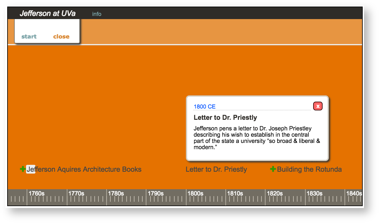 Image Added Image Added
|
To If you want to create a timeline:
- Create a Google Spreadsheet
Enter your data
- Format your spreadsheet
- Log in to Visuals
- Connect your Google Drive to Visuals
- Create a new visualization
1. Create a Google Spreadsheet
Visuals pulls data from your Google account to make visualizations. To start making a timeline, put your data into Google Sheets.
First, go to docs.google.com. You'll see the Google log in page.
 Image Removed
You can use any Google address as the account. Remember, UVA students have "@virginia.edu" addresses that work with Google Drive.
| Section |
|---|
| Column |
|---|
|  Image Added Image Added
|
| Column |
|---|
| Enter your email, then click Next. |
|
Enter your UVa email, then click Next. Log in with your Netbadge credentials. You'll see the University of Virginia Google Drive page (or the standard Google Drive page if you entered a non-UVa address).Click New, then Google Sheets to
| Section |
|---|
| Column |
|---|
| 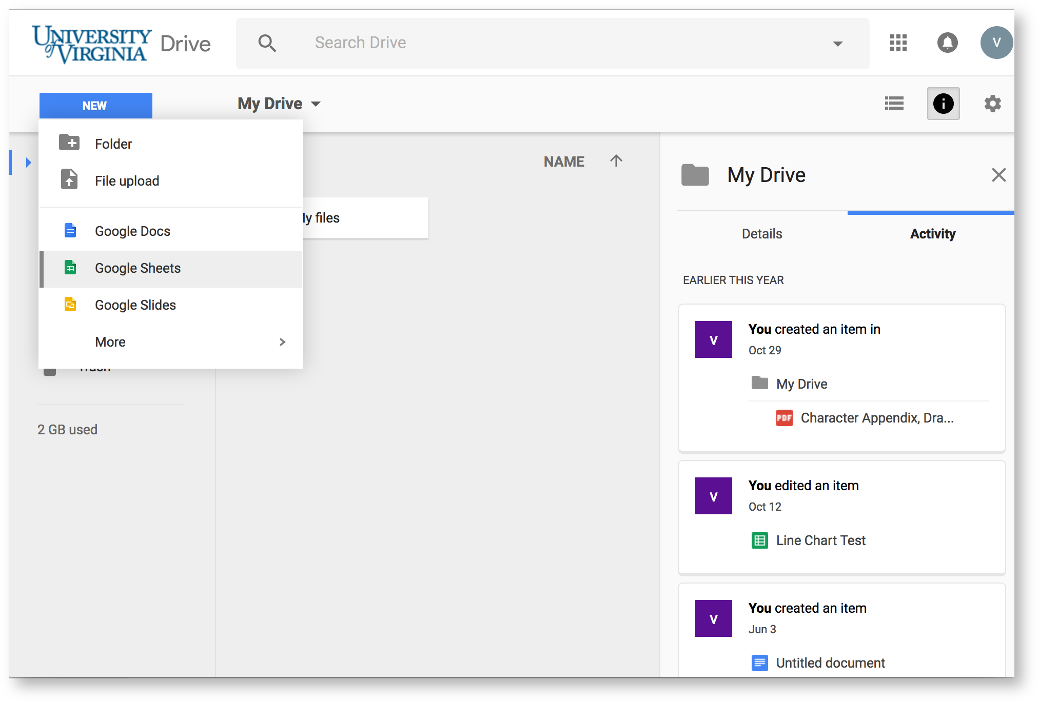 Image Added Image Added
|
| Column |
|---|
| Click New, then Google Sheets to make your new spreadsheet. |
|
...
| Section |
|---|
| Column |
|---|
|  Image Added Image Added
|
|
...
This is where you will enter your data. Before you start that process, however, you should make your spreadsheet accessible to Audio-Video. |
|
...
Image Removed
...
To do this, click Share in the top right corner |
|
...
| Section |
|---|
| Column |
|---|
| 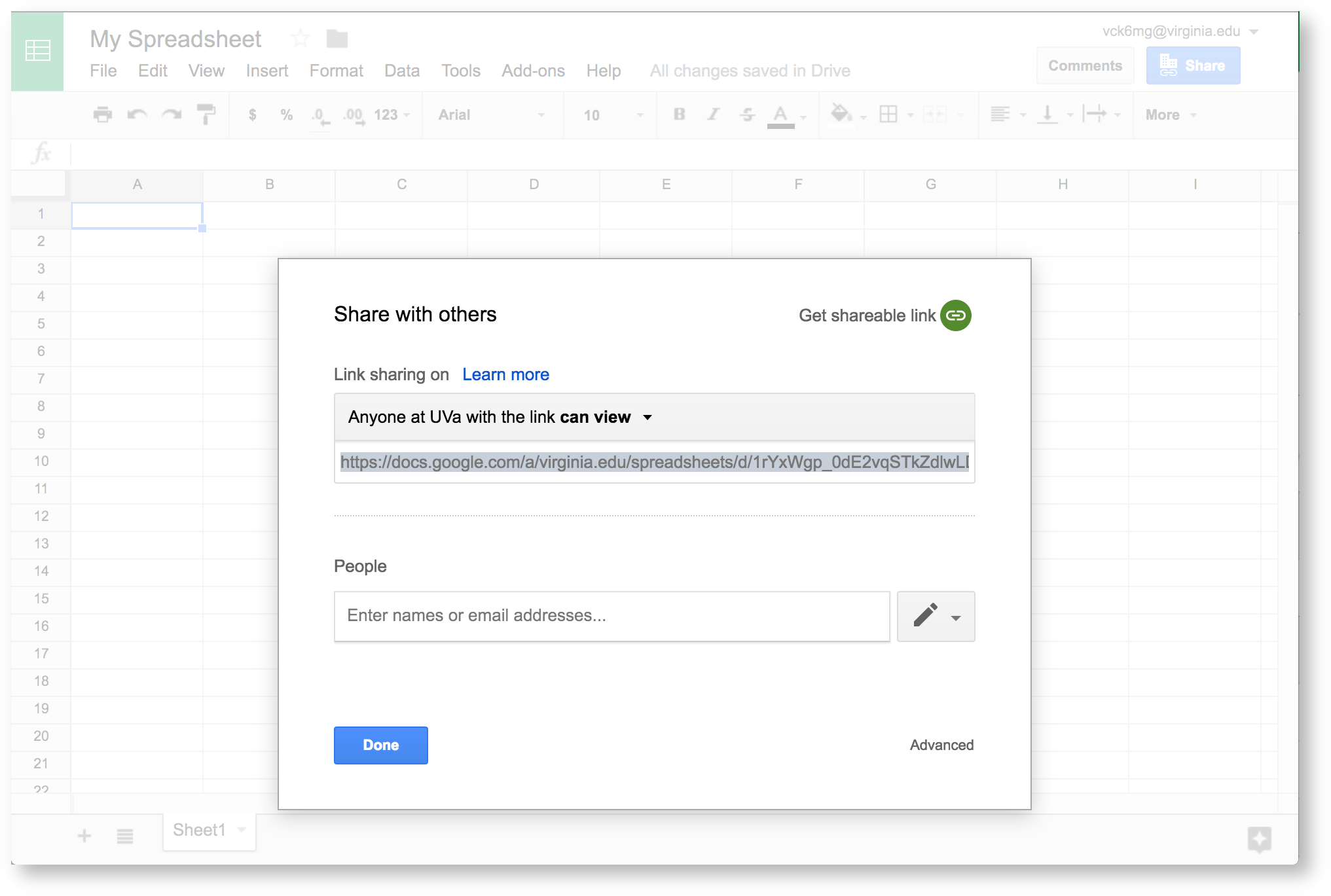 Image Added Image Added
|
|
...
Then, Get shareable link. This automatically turns on link sharing. |
|
Image Removed
The default setting restricts sharing to UVa UVA viewers. We need to make a few more changes so anyone with a link can access your data. If you're not using a UVA Google Drive Account, you can skip ahead to the next section.
| Section |
|---|
| Column |
|---|
| 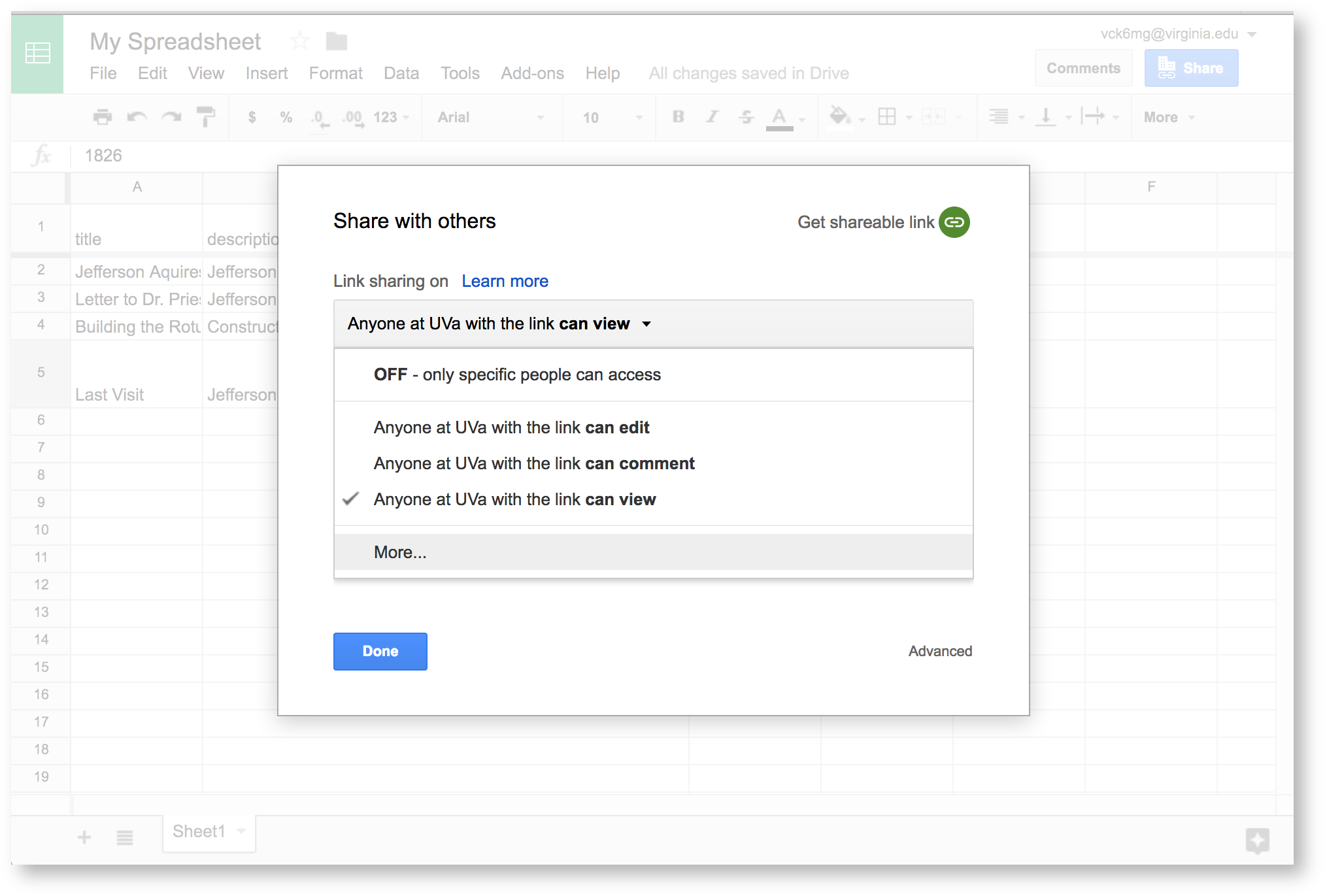 Image Added Image Added
|
|
...
...
at UVa with the link can view. You'll see extra options. |
|
...
...
to see all privacy options. |
|
Image Removed
...
| Section |
|---|
| Column |
|---|
|  Image Added Image Added
|
| Column |
|---|
Choose On - Anyone with the link, |
|
...
...
...
to finish adjusting privacy settings. |
|
...
Now you're ready to enter your data.
...
At this point, you should pull up our Timeline guide for quick reference. This gives you the specifics for data formattingtells you how to format your data so Visuals can read it. In general, you'll use individual chart guides in our Visualization Index to find out about formatting.
Here, we're making a simple spreadsheet. Enter
| Section |
|---|
| Column |
|---|
| 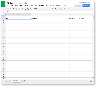 Image Added Image Added
|
| Column |
|---|
| Enter all required labels at on the top row of the spreadsheet. These are: - title
- description
- startdate
- enddate
|
|
| Section |
|---|
| Column |
|---|
| 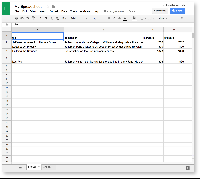 Image Added Image Added |
|
 Image Removed
Make sure to copy the names exactly as they're written in the index.
...
| Now, fill in your data for each cell. You'll see from |
|
...
...
that each row represents an event on the timeline. We've entered four events in the example |
|
...
to the left. This data was taken from |
|
...
 Image Removed
Now that you’ve entered your data, it’s time to format it.
...
If you pull up our Timeline reference guide, you'll see that the first row you filled out contains data labels. We need to “freeze” this row. This "Freezing" helps Audio-Video read the data you entered.
| Section |
|---|
| Column |
|---|
|  Image Added Image Added
|
| Column |
|---|
To freeze the first row, |
|
...
...
...
...
...
gray line will appear under this row. |
|
 Image Removed
The Timeline reference guide also has specific data types for each column. Luckily, our example is easy: every column should be in the "plain text" data type.
| Section |
|---|
| Column |
|---|
| 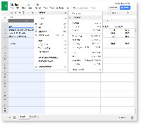 Image Added Image Added |
| Column |
|---|
| To set the data type, select your column. |
|
...
...
...
...
Choose Plain Text. Do this for each column. |
|
...
Now your data is ready to go, and you can move to Mandala Audio-Video.
4. Log in to visuals
Signing in to Visuals lets you create visualizations.
...
| Section |
|---|
| Column |
|---|
|  Image Added Image Added |
| Column |
|---|
| Click on the Main Menu icon ( Image Added) in the top right corner. Then, Log in via Netbadge. Image Added) in the top right corner. Then, Log in via Netbadge. |
|
Enter your Netbadge credentials to finish logging in. Now we'll connect your Visuals account to your Google Drive accountmake your visualization.
6. Create your timeline
From the Visuals homepage, Create a visualization.
| Section |
|---|
| Column |
|---|
| 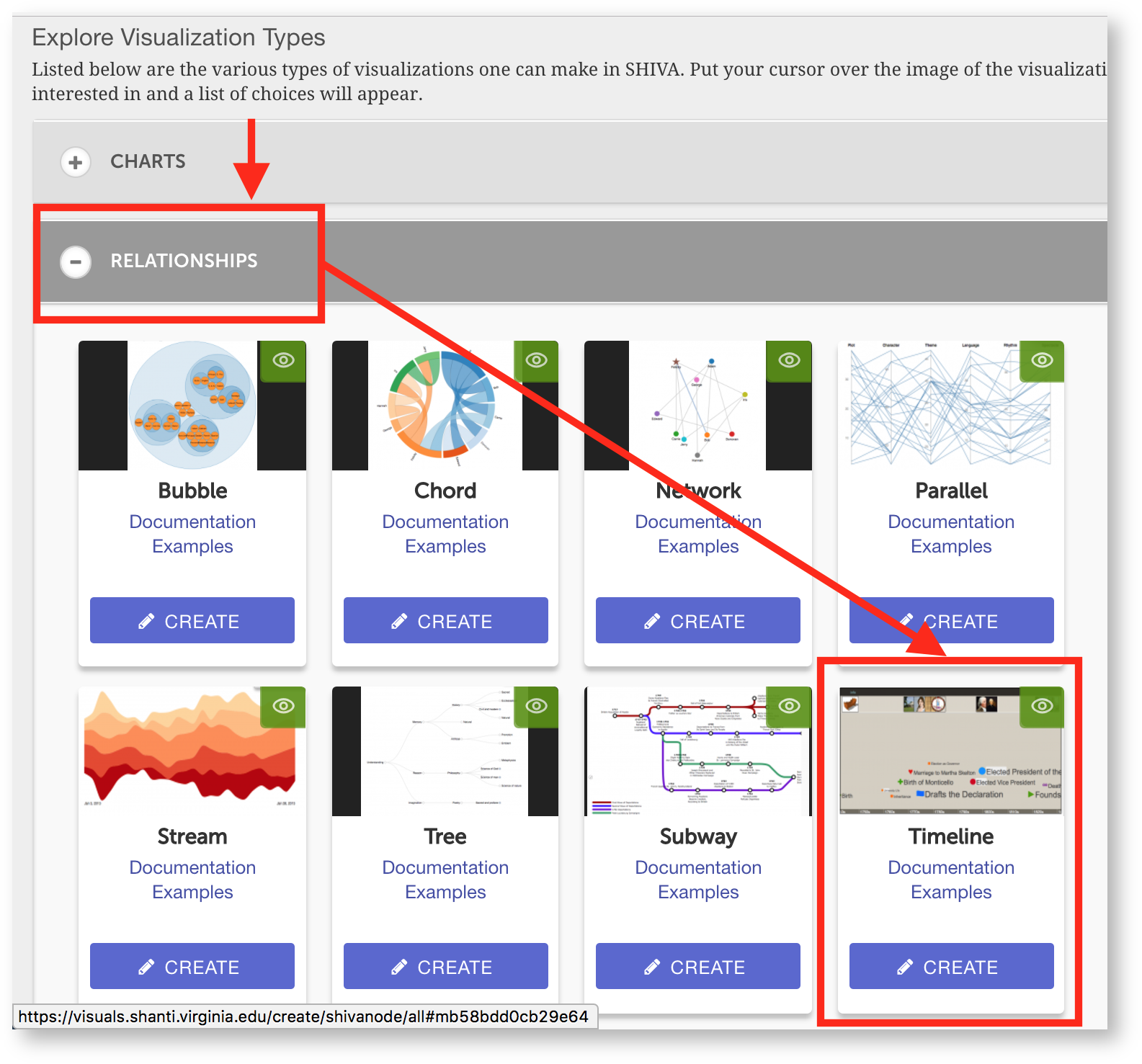 Image Added Image Added
|
|
...
...
You'll see the visualization editor and a list of spreadsheets on preview of your timeline. Now we need to add your spreadsheet to the editor. Find the "Source of events" field and click on the triangle Google Drive icon next to it. You'll see a list of your Google Drive . Click Visualize as timeline next accounts. Log in to the account that holds your data spreadsheet.
Google will ask if you give Shanti permission to see your files: click Allow. You'll see a Google Drive window in Visuals with your timeline data.a list of your files.
| Section |
|---|
| Column |
|---|
| 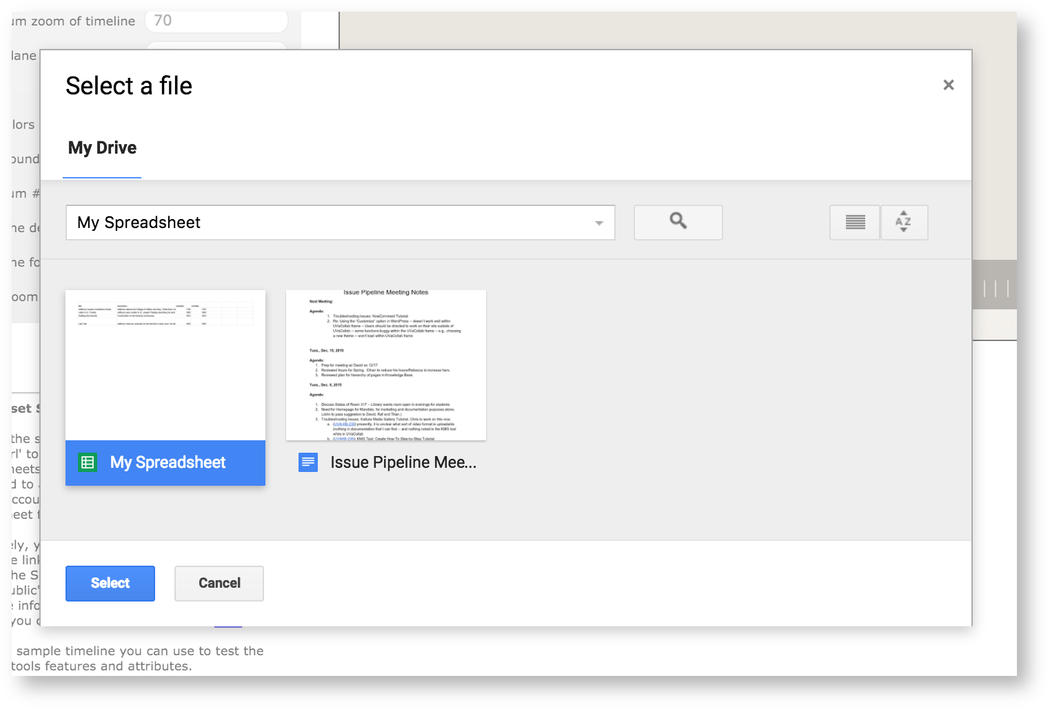 Image Added Image Added |
| Column |
|---|
Select the spreadsheet you made in step 1. |
|
You'll see the visualization editor and a preview of your timeline in the editor.
 Image Removed
Now we'll use the options in the sidebar to customize your timeline.
| Section |
|---|
| Column |
|---|
| 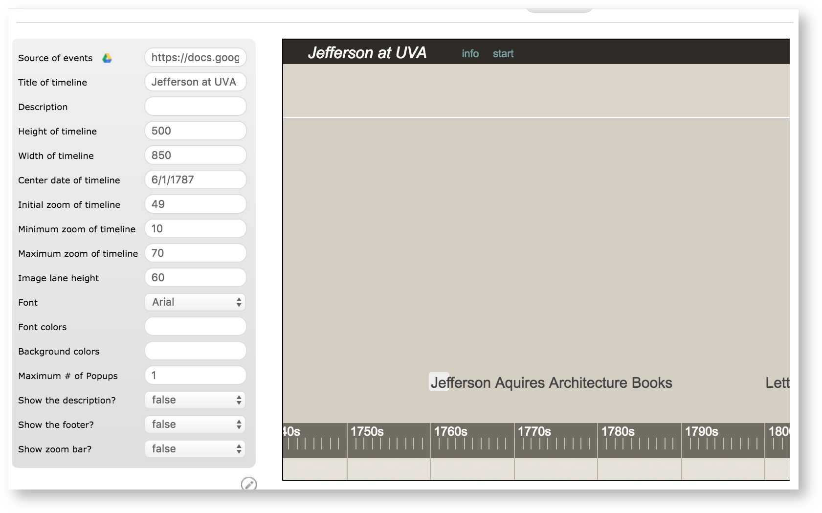 Image Added Image Added |
| Column |
|---|
First, we'll add a title in the "Title of timeline" field. Here, we've entered "Jefferson at UVA" |
|
The default timeline view doesn't show all the events. You can see that the events "Last Visit" and "Building the Rotunda" are cut off on the left, while there is plenty of empty space on the right. Let's fix that.
| Section |
|---|
| Column |
|---|
| 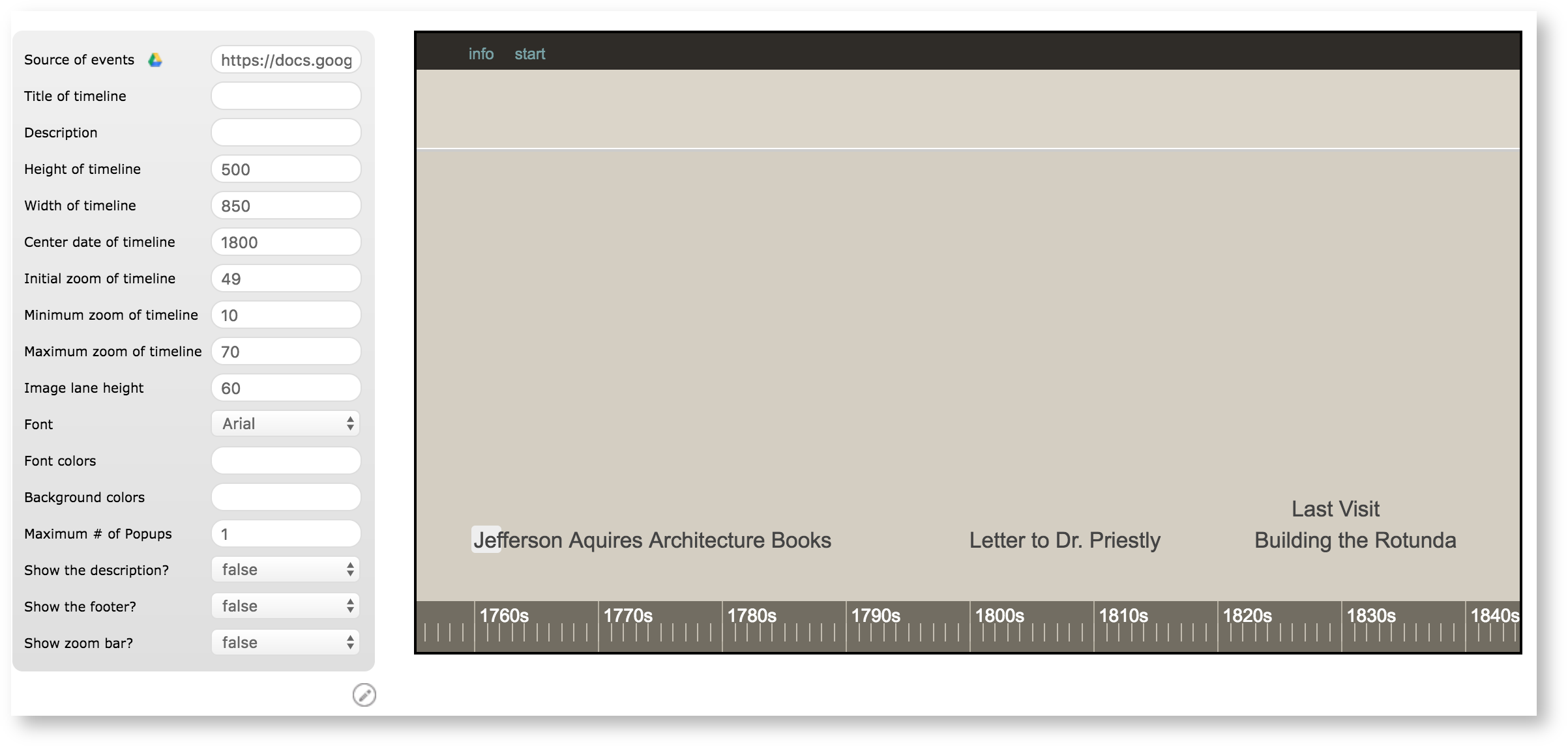 Image Added Image Added
|
| Column |
|---|
First, set "Center date |
|
...
of timeline." 1800 seems like a good place to center the timeline |
|
...
. According to the Visualization Index, however, this field should be in the DD/MM/YYYY format. We'll pick an arbitrary date and enter "01/01/1800" in the field. If you want to set a specific day, you would use the month/day/year format ("01/25/1800"). |
|
Image Removed
That looks a lot better. Now we can see all the events in the default view.
| Section |
|---|
| Column |
|---|
| 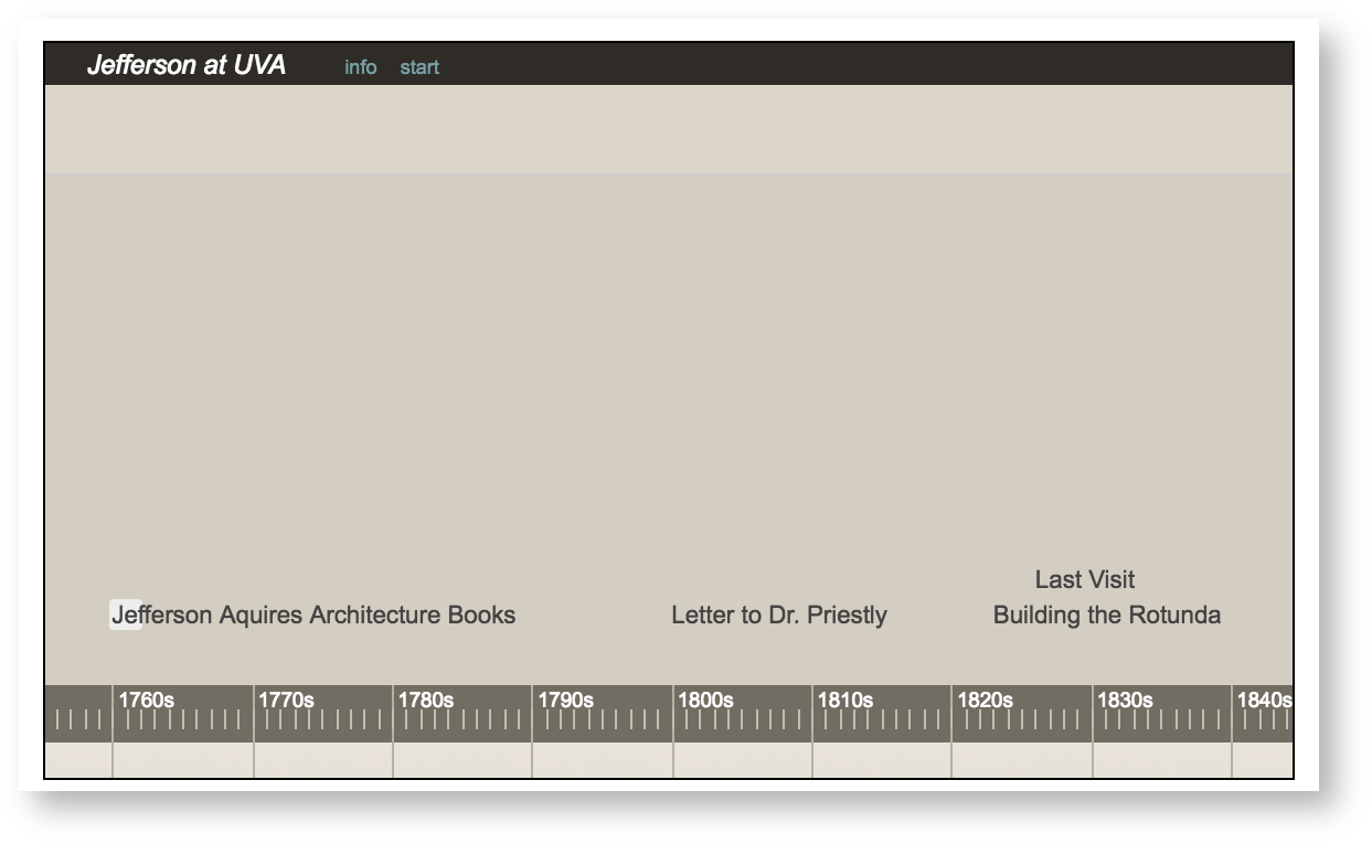 Image Added Image Added |
| Column |
|---|
| Let's add a title in the "Title of timeline" field. |
|
...
...
The timeline still isn't very informative, however – how will viewers understand the significance of the letter to Dr. Priestly, for example? Let's make the visualization show a description of the event, which we entered in column B of our spreadsheet.
| Section |
|---|
| Column |
|---|
| 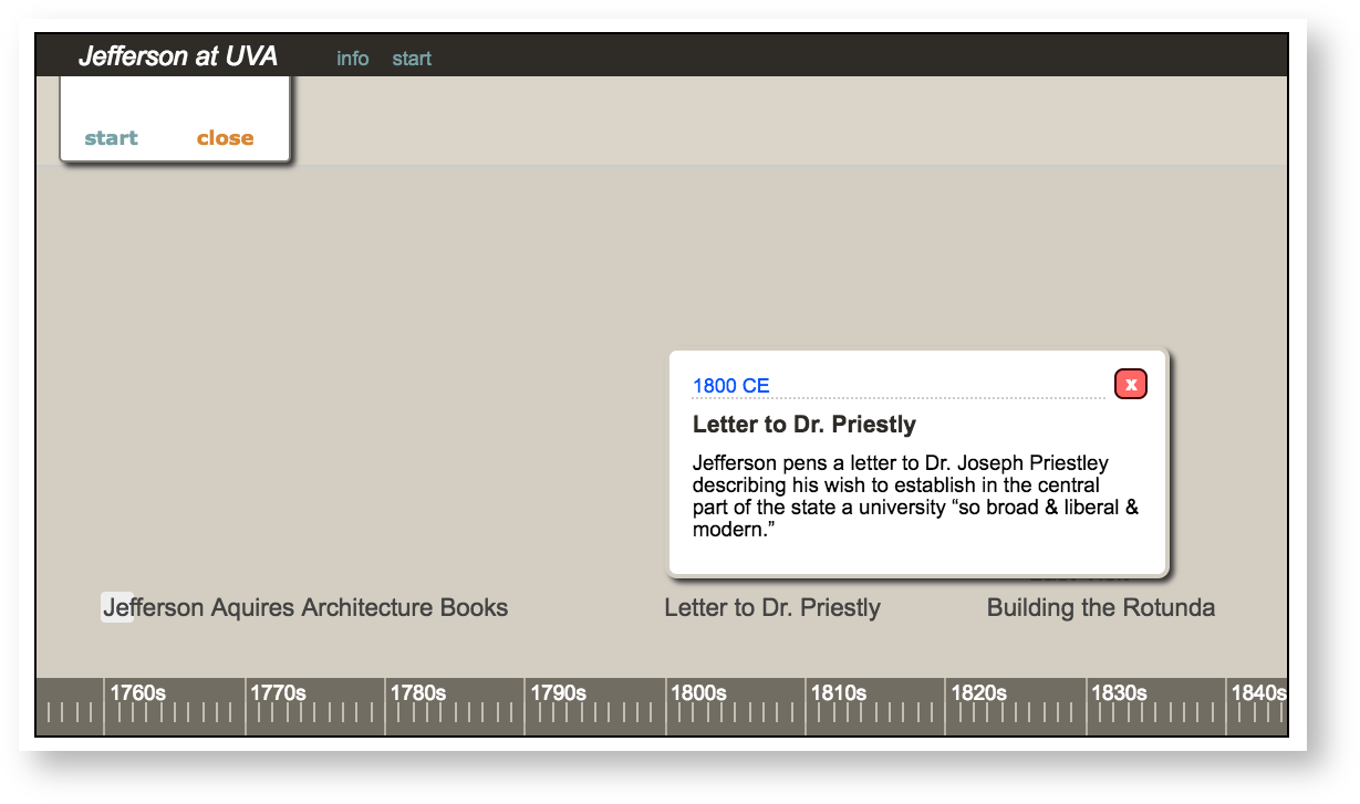 Image Added Image Added |
|
...
change Show the description |
|
...
...
to true. Now when a viewer clicks on an event, a description will pop up. |
|
...
The timeline still looks slightly plain. Let's mark each event about architecture. You can see that the index guide for the Timeline has an "icon" column on the data sheet. This means you can add icons to events by making a new "icon" column.
Go back to the spreadsheet and add icon in a new column on the header. Remember to enter the label exactly.
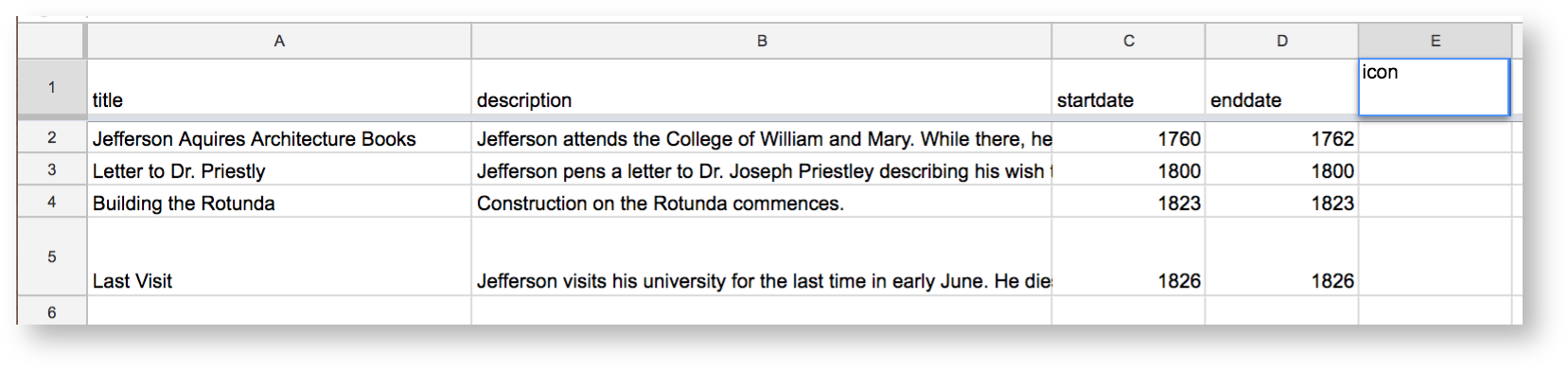 Image Added
You can then enter the name of the icon you want to add: here we're using "plus_green.png." Check the Visualization Index to see all your icon options.
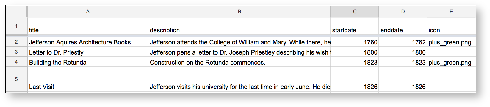 Image Added
 Image Removed
Now let's change the color of the background to something more UVA-appropriate. Click
| Section |
|---|
| Column |
|---|
| 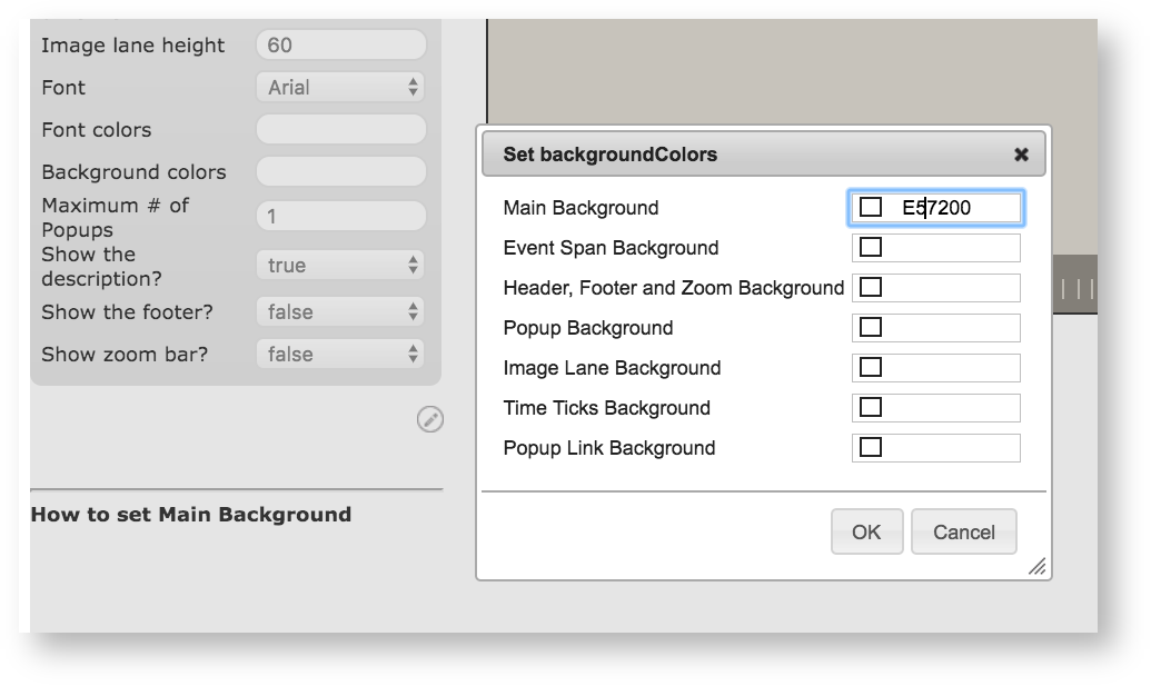 Image Added Image Added |
| Column |
|---|
Click Background colors, then enter the hexadecimal code for UVA orange (E57200) in the "main background" field. |
|
...
...
Now we're done.
| Section |
|---|
| Column |
|---|
| 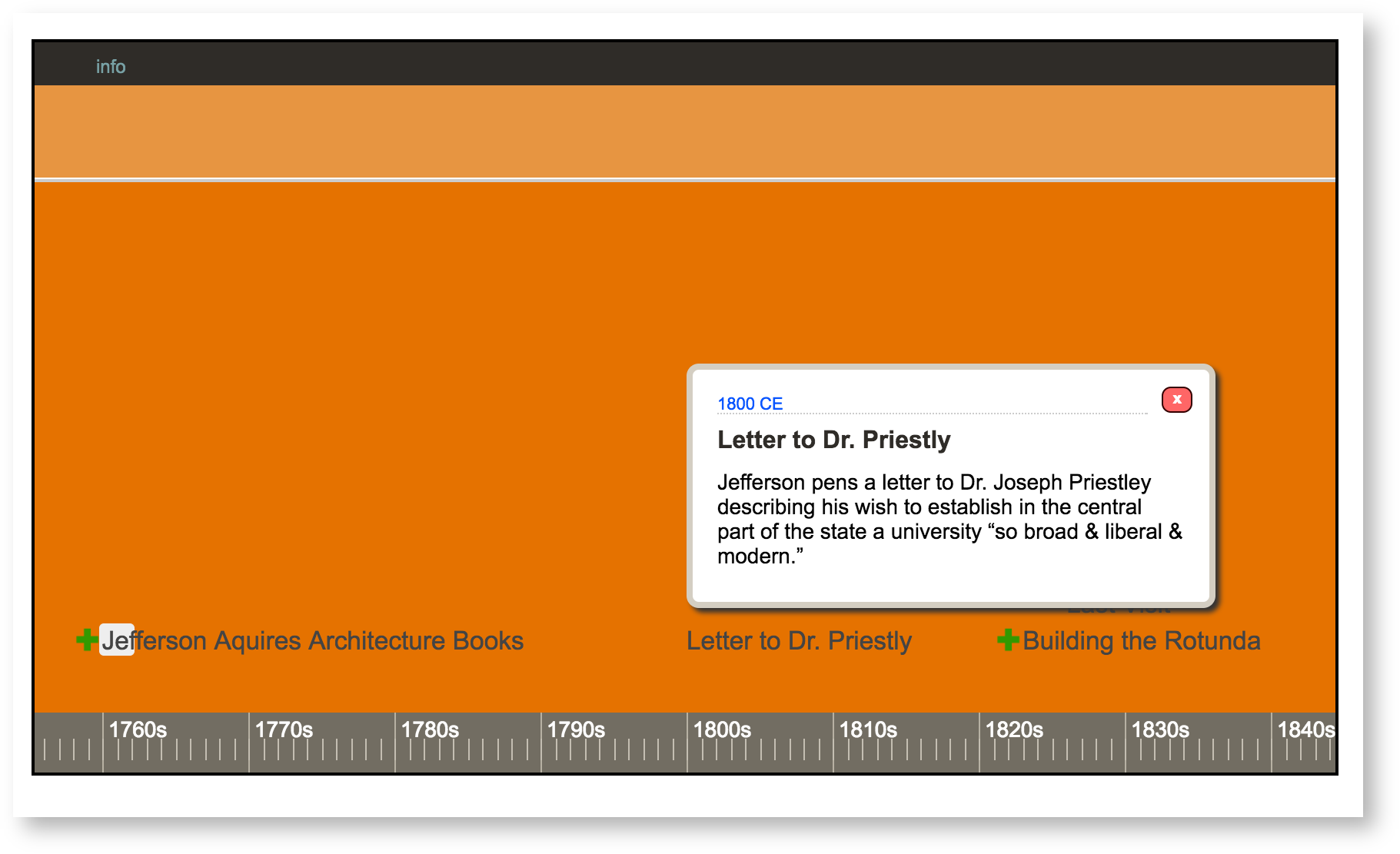 Image Added Image Added |
| Column |
|---|
This is what your timeline should look like |
|
...
Remember, you can find out more about th
the different options for your timeline with the Visualization Index.
To finish making your timeline, give the visualization a title in the "Title" field at the top of the page, then choose Public under the "Visibility" options at the bottom of the page.
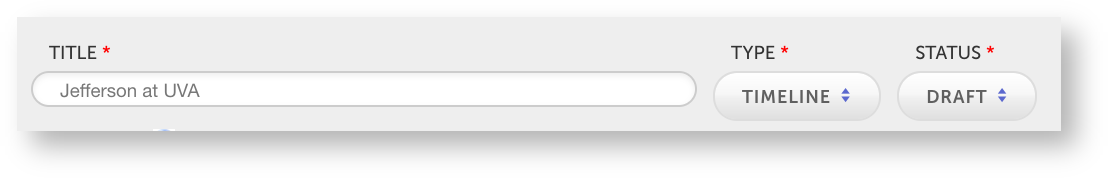 Image Added
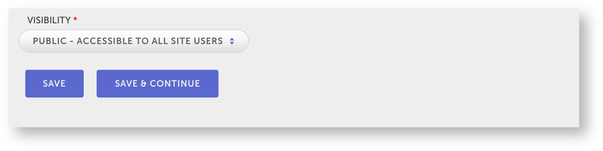 Image Added
Save your visualization.
Now you're finished with your project. To learn more about making visualizations, you can use this Visuals in Mandala guide.