Example
Spreadsheet Format
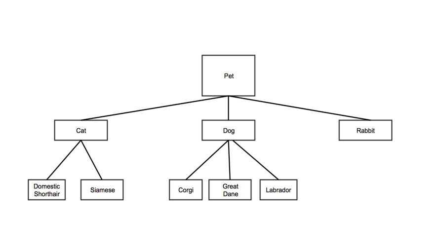
Tree data structures are hierarchical. Each node has a parent nodes. In the example below, "Pet" is the parent of "Cat," "Dog," and "Rabbit". "Cat" is the parent of "Domestic Shorthair" and "Siamese." "Pet" is also the root note, since it has no parent.
Each row in the Tree Map data spreadsheet represents a node on the tree.
| Anchor | ||||
|---|---|---|---|---|
|
| Column 1 | Column 2 | Column 3 | Column 4 | |
|---|---|---|---|---|
| Data Type | plain text | plain text | number | number |
| Contents | The name of the node. | The name of the node's parent. Note:
| A value for the node. Note:
| A second value for the node. Note:
|
| Optional | x |
For the sample tree above, the first two columns might look like this:
| Node | Parent |
|---|---|
| Pet | |
| Cat | Pet |
| Dog | Pet |
| Rabbit | Pet |
| Domestic Shorthair | Cat |
| Siamese | Cat |
| Corgi | Dog |
| Great Dane | Dog |
| Labrador | Dog |
Customization Options
| Table of Contents | ||
|---|---|---|
|
Go to Common Customization Options for more settings.
Font family
sets the font for the text on your chart
- Type the name of the font family in the field
- Use web-safe fonts: these fonts are installed on most browsers
- Web-safe fonts include Arial, Arial Black, Courier New, Tahoma, Times New Roman, Verdana, and others
Header color
sets the color of the header text for each node
- Click the colored square to choose your color
- Learn more about choosing colors
Header height
sets the height of the header section for each node
- Type in a number
- "0" makes the header invisible
Header highlight color
sets the color of text headers when you hover over them
- Click the colored square to choose your color
- Learn more about choosing colors
Anchor maximum-color maximum-color
Maximum color
| maximum-color | |
| maximum-color |
this is the color represented by the number in the fourth column of your spreadsheet. If you did not choose a value in this column of the spreadsheet, you can choose a color here to set the scale by the which the rest of the colors are generated.
- Click the colored square to choose your color
- Learn more about choosing colors
Maximum color value
sets the highest values for your chart's color scale
- Type in a value (numeric)
- Nodes with values greater or equal to this number have the maximum color
- Set node values in column 4 of the data spreadsheet
Max levels
sets the number of node levels you want your chart to show at the same time
- Type in a number
- For example, if you don't want to show any child nodes, type in 1, and if you want to show root nodes plus one child node, type in 2
- Note that if your tree has more levels than this number, the viewer will need to click the visible nodes to see additional levels
Max levels to hint at
shows the number of node levels beyond the maximum level that a user can view
- Type in a number
Maximum highlight color
sets the highlighting color of the largest node
- Click the colored square to choose your color
- Learn more about choosing colors
Middle color
sets the color for the node halfway between the largest and the smallest
- Click the colored square to choose your color
- Learn more about choosing colors
Middle color value
determines the section of nodes that appear in the middle color
- Type in a number
- Note that nodes with values below that number will not appear in the middle color
Middle highlight color
sets the highlighting color for the node with a column 3 value that falls between the maximum color value and the minimum color value in your spreadsheet. The highlight will be a color between the maximum color value and the minimum color value
- Click the colored square to choose your color
- Learn more about choosing colors
Minimum color
sets the color of the node(s) representing the smallest column 4 values
- Click the colored square to choose your color
- Learn more about choosing colors
Minimum color value
determines the least intense color that appears in your chart
- Click the colored square to choose your color
- Learn more about choosing colors
Minimum highlight color
sets the highlighting color for the node with a column 3 value that is nearest the minimum color value
- Click the colored square to choose your color
- Learn more about choosing colors
No value color
sets the color of nodes without a value in the third column of the spreadsheet.
- Click the colored square to choose your color
- Learn more about choosing colors
No value color value
sets the color of nodes that were not given a specific color in the third column of the spreadsheet. Sets the value to use for a rectangle of 'no' color when highlighted.
- All values greater than this will be trimmed to this value
- If set to null or "auto," the value will be set to the max value in the column
No value highlight color
highlights areas of the chart without values
choose to have sections of the chart with no color be highlighted in a color when you hover the mouse over them
- Click the colored square to choose your color
- Learn more about choosing colors
Show tooltips?
displays a text tooltip when you hover over a node
- "True" shows tooltips
- "False" hides tooltips
