...
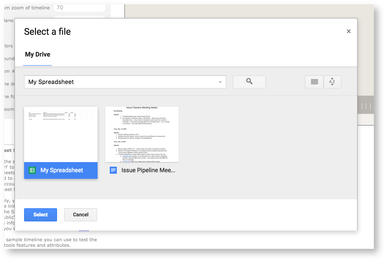
Select the spreadsheet you made in step 1.
You'll see a preview of your timeline in the editor.

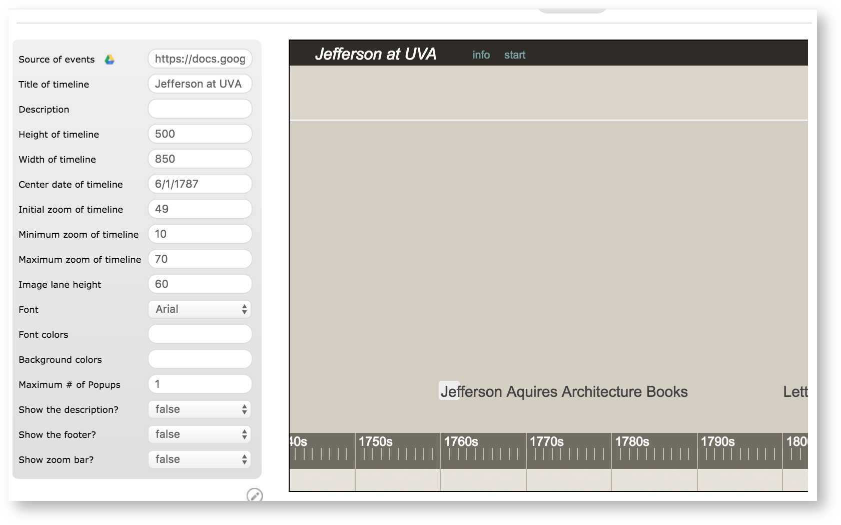
Now we'll use the options in the sidebar to customize your timeline.
First, we'll add a title in the "Title of timeline" field. Here, we've entered
The default timeline view doesn't show all the events. You can see that the events "Last Visit" and "Building the Rotunda" are cut off on the left, while there is plenty of empty space on the right. Let's fix that.
...
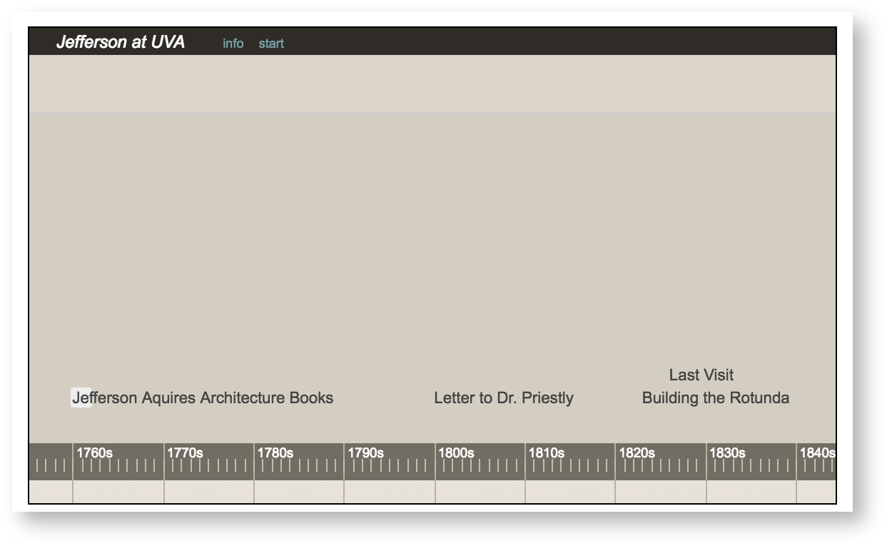
That looks a lot better. Now we can see all the events in the default view. Let's add a title in the "Title of timeline" field.
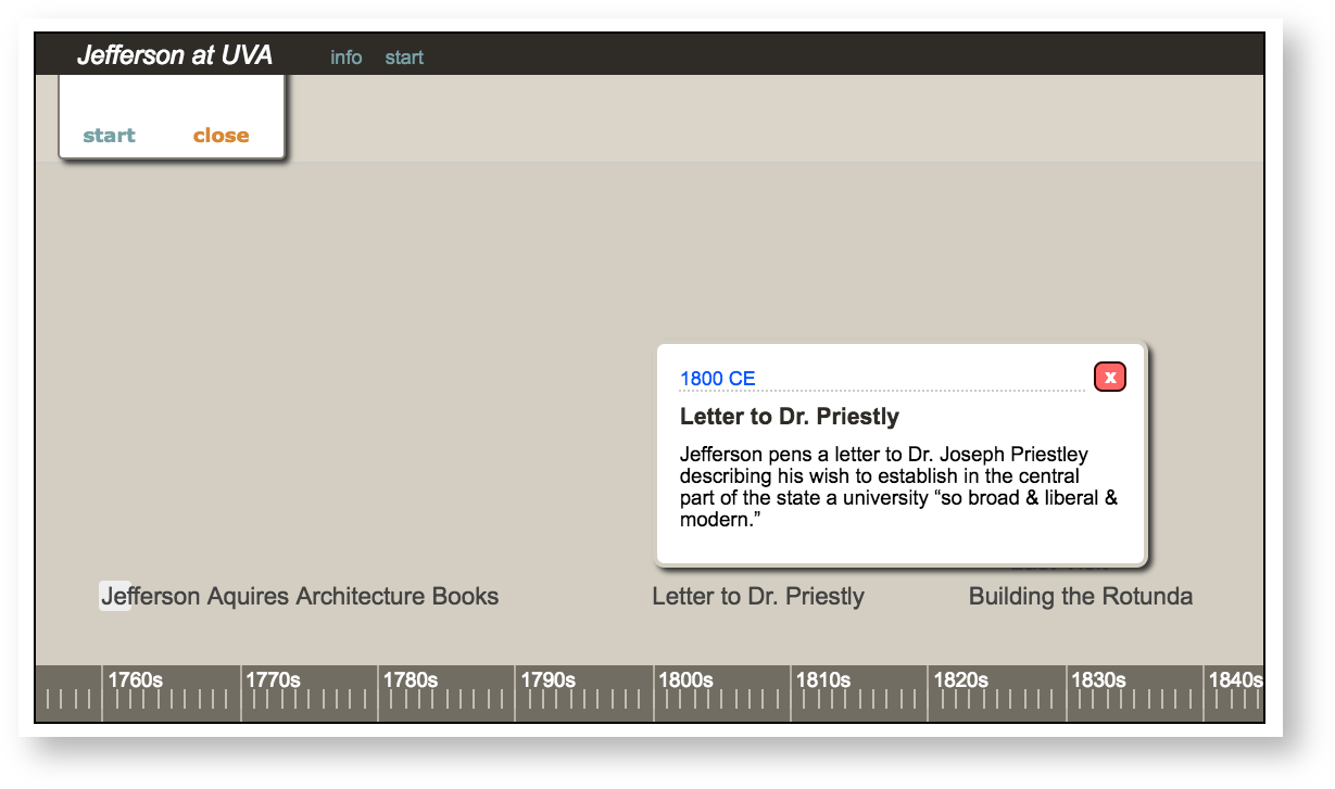
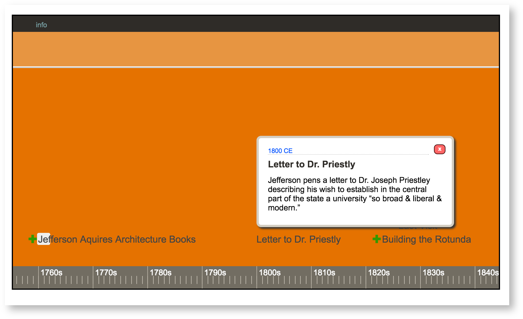
The timeline still isn't very informative, however – how will viewers understand the significance of the letter to Dr. Priestly, for example? Let's make the visualization show a description of the event, which we entered in column B of our spreadsheet. To do this, change Show the description from false to true. Now when a viewer clicks on an event, a description will pop up.

The timeline still looks slightly plain. Let's mark each event about architecture. You can see that the index guide for the Timeline has an "icon" column on the data sheet. This means you can add icons to events by making a new "icon" column.
Go back to the spreadsheet and add icon in a new column on the header. Remember to enter the label exactly.

You can then enter the name of the icon you want to add: here we're using "plus_green.png."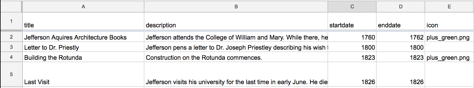
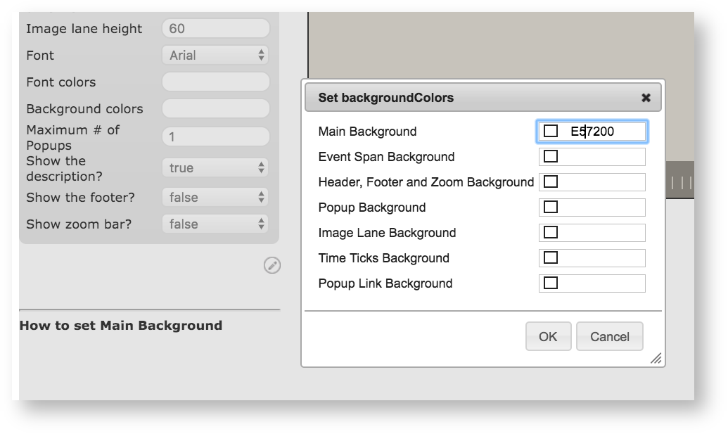
Now let's change the color of the background to something more UVA-appropriate. Click Background colors, then enter the hexadecimal code for UVA orange (E57200) in the "main background" field. Click OK to apply the color.
Now we're done. This is what your timeline should look like:

Remember, you can find out more about ththe different options for your timeline with the Visualization Index.
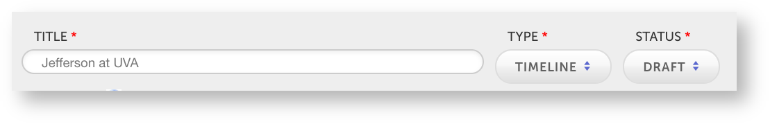
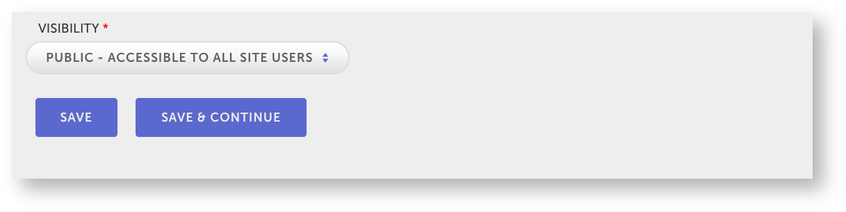
To finish making your timeline, give the visualization a title in the "Title" field at the top of the page, then choose Public under the "Visibility" options at the bottom of the page.
Save your visualization.