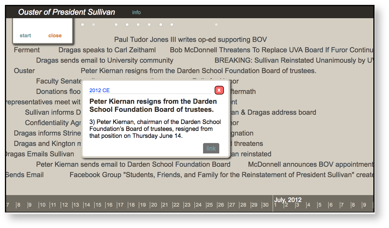
This guide helps you create a collaborative, student-crowdsourced timeline in Mandala Visuals.  John Alexander used this timeline for the course he co-taught with Walt Heinecke "Documenting UVA's Future." This course, inspired by the ouster and reinstatement of UVA President Teresa Sullivan, documented the event using oral histories. Since many students were not in Charlottesville for the ouster, John Alexander helped them make a collaborative timeline of the proceedings in class, which included links to primary sources. This helped them understand the flow of information surrounding the ouster. Afterward, he shared the timeline with his students, so that they could reference it throughout the semester. To make a crowdsourced timeline: - Create a Google Spreadsheet
Enter your data - Format your spreadsheet
- Log in to Visuals
- Create a new visualization
Invite student contributions in class - Add the visualization to UVaCollab
|
In this guide, Google and the Google logo are registered trademarks of Google Inc., used with permission. 1. Create a Google Spreadsheet
Visuals pulls data from your Google account to make visualizations. To start making a timeline, put your data into Google Sheets.
First, go to drive.google.com. You'll see the Google log in page.
You can use any Google address as the account. Remember, UVA students have "@virginia.edu" addresses that work with Google Drive.
Enter your email, then click Next. |
|
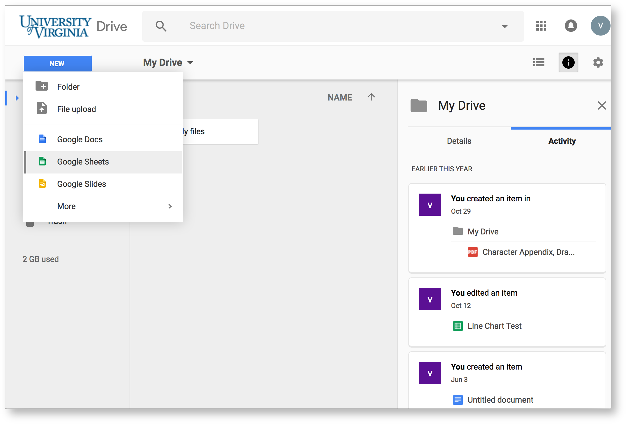
Log in with your Netbadge credentials. You'll see the University of Virginia Google Drive page (or the standard Google Drive page if you entered a non-UVA address).
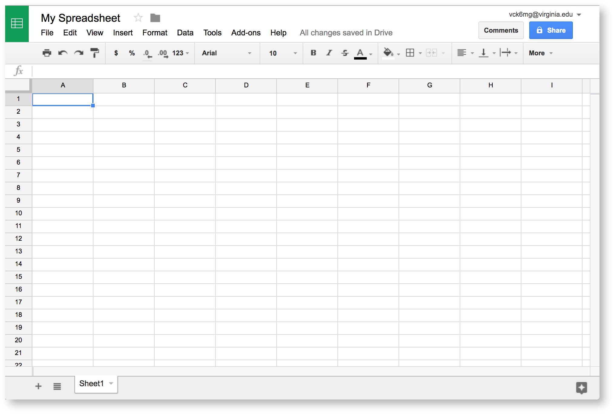
Click New, then Google Sheets to make your new spreadsheet. |
|
This is where you will enter your data. Before you start that process, however, you should make your spreadsheet accessible to Audio-Video. . Make sure to title your spreadsheet if you have not done so. |
|
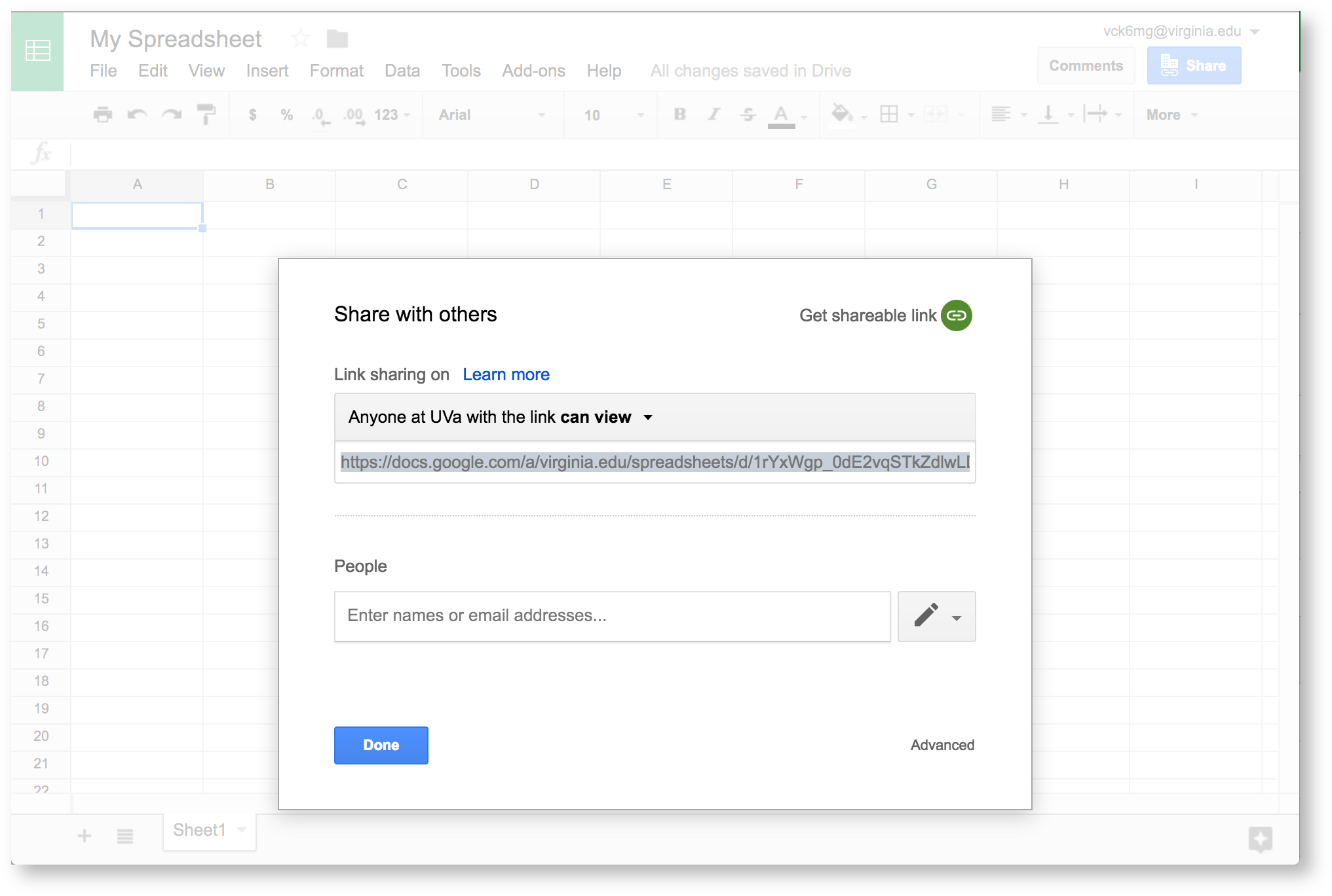
Then, Get shareable link. This automatically turns on link sharing. |
|
The default setting restricts sharing to UVA viewers. We need to make a few more changes so anyone with a link can access your data. If you're using a standard "@gmail.com" Google Drive account, simply change Anyone at with the link can view to can edit. Then you can skip ahead to the next section. If you're using a UVA-affiliated account, continue reading.
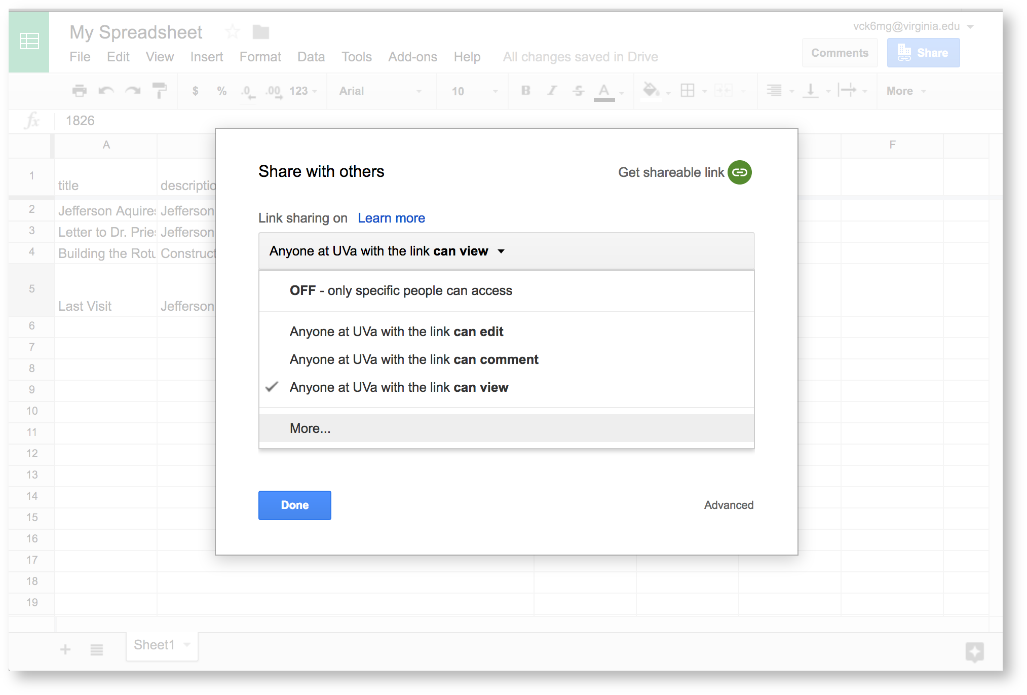
First, click Anyone at UVa with the link can view. You'll see extra options. Click More to see all privacy options. |
|
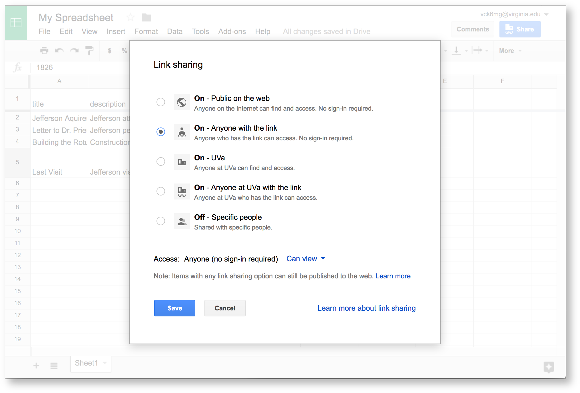
Choose On - Click Done to finish adjusting privacy settings. |
|
Now you're ready to enter your data.
 2. Enter your data
At this point, you should pull up our Timeline guide for quick reference. This tells you how to format your data so Visuals can read it. In general, you'll use individual chart guides in our Visualization Index to find out about formatting.
Here, we're making a simple spreadsheet.
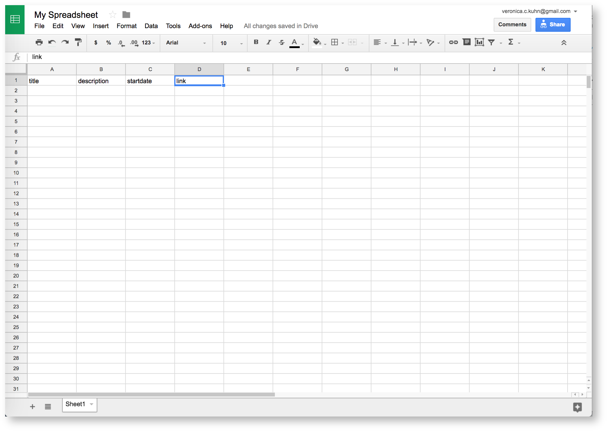
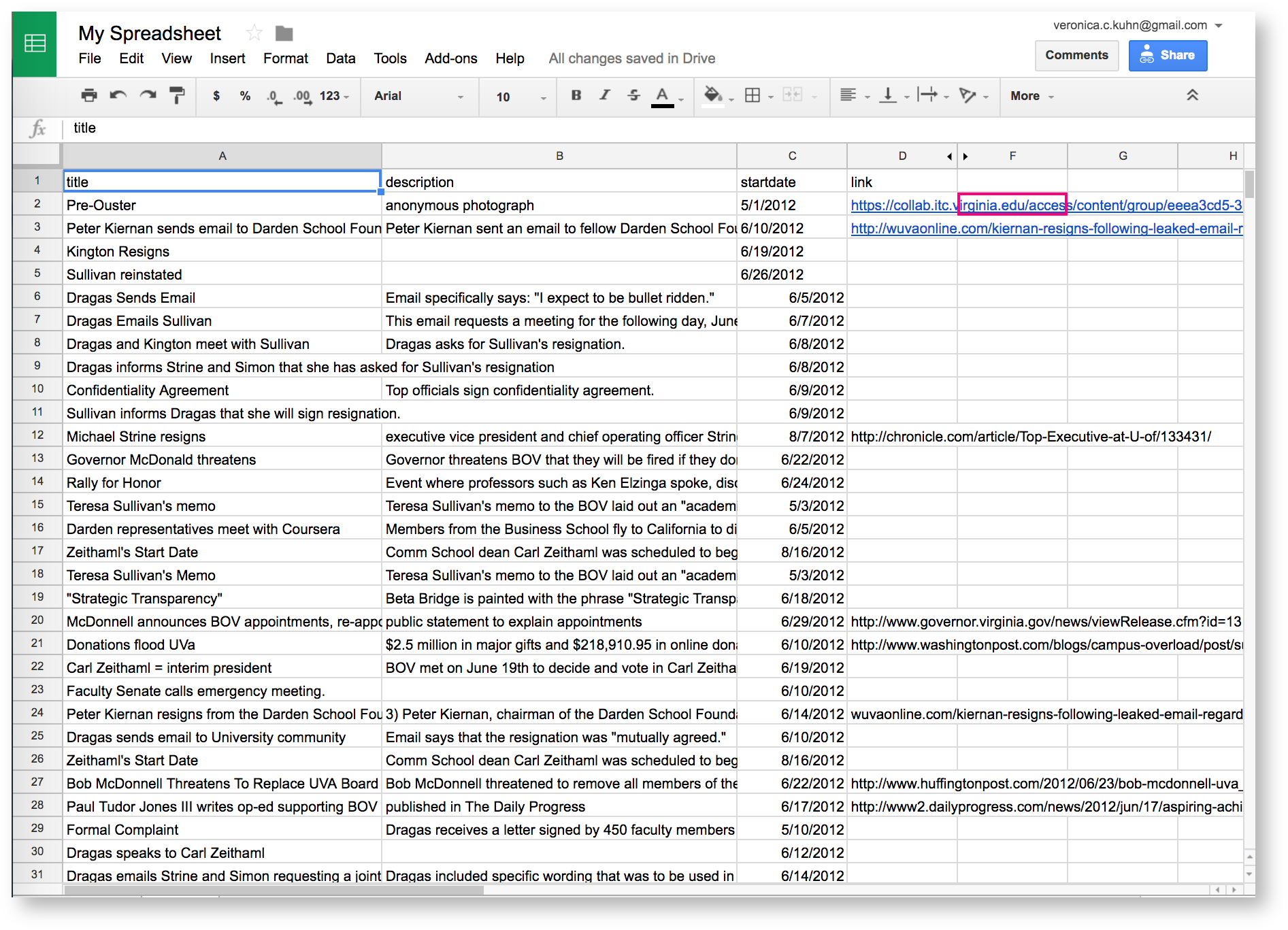
Enter all labels you need on the top row of the spreadsheet. These are: - title
- description
- startdate
- link
Copy these labels exactly, without any extra spaces or capitalization. These labels let Visuals read your data, so the timeline will break if they aren't accurate. |
|
|
You'll leave the rows themselves blank. In class, each student will add a row to the spreadsheet, creating a single event. Before they can do that, however, you should make sure rows are formatted correctly.
 3. Format your spreadsheet
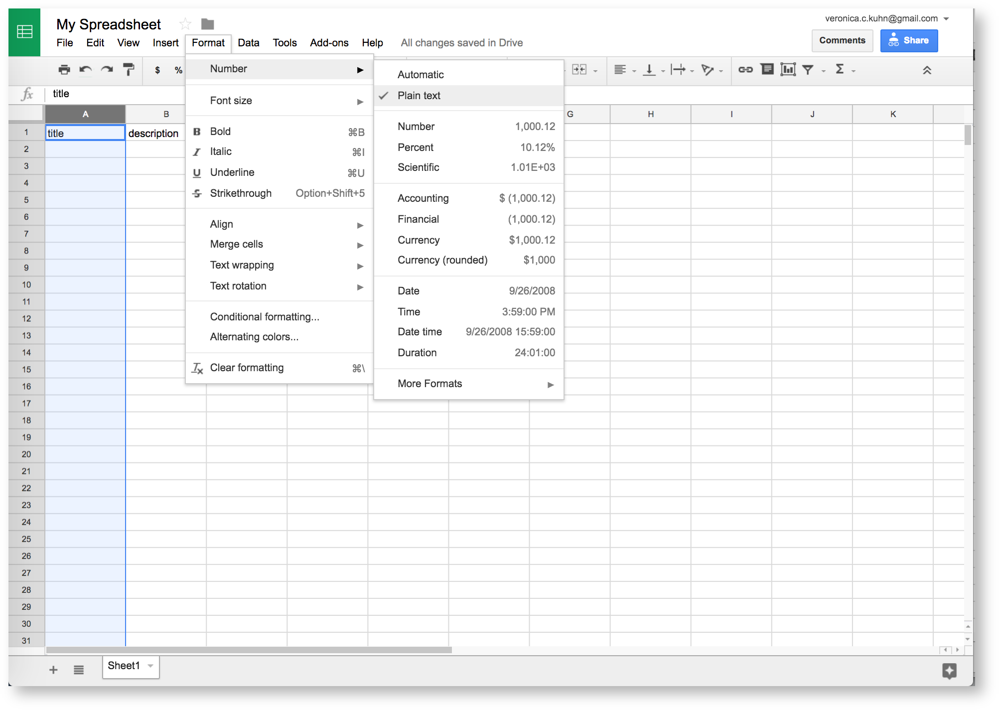
The Timeline reference guide has specific data types for each column. Luckily, our example is easy: every column should be in the "plain text" data type.
To set the data type, select your column. Click Format from the menu, then Number. Choose Plain Text. Do this for each column. |
|
 4. Log in to Visuals
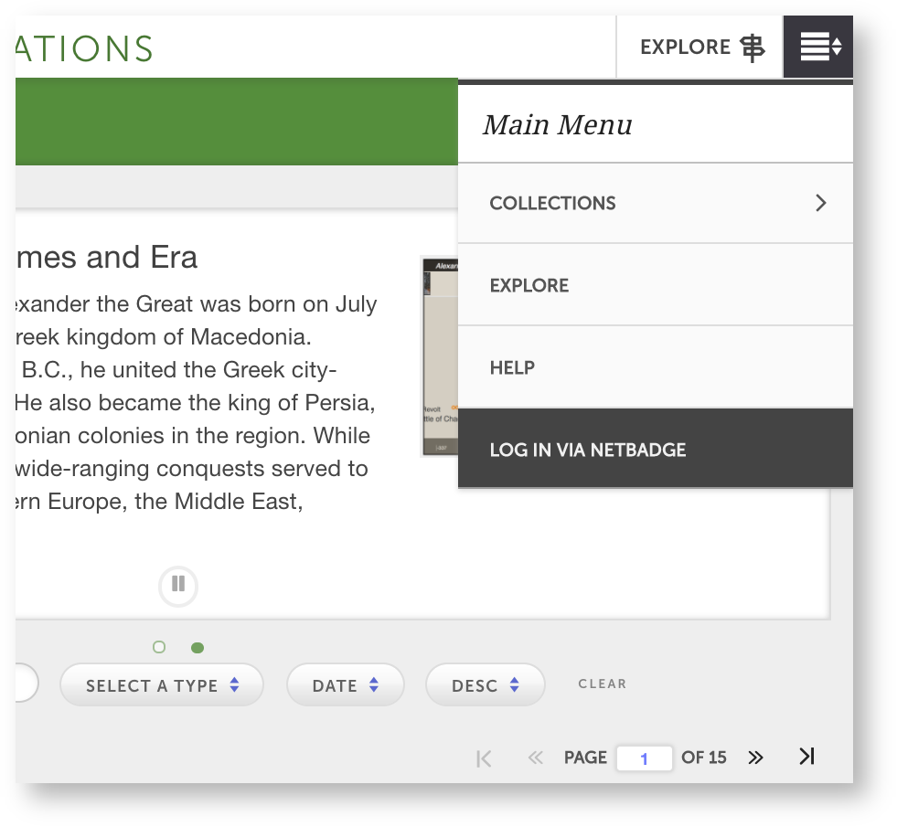
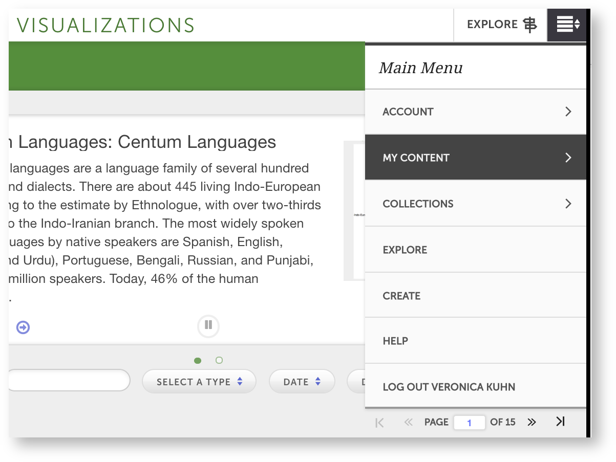
Click on the Main Menu icon (  ) in the top right corner. Then, Log in via Netbadge. ) in the top right corner. Then, Log in via Netbadge. |
|
 5. Create your timeline
Make sure to log in before making your timeline. Then:
Click  > Collections > Create. A list of visualization types will open. > Collections > Create. A list of visualization types will open. |
|
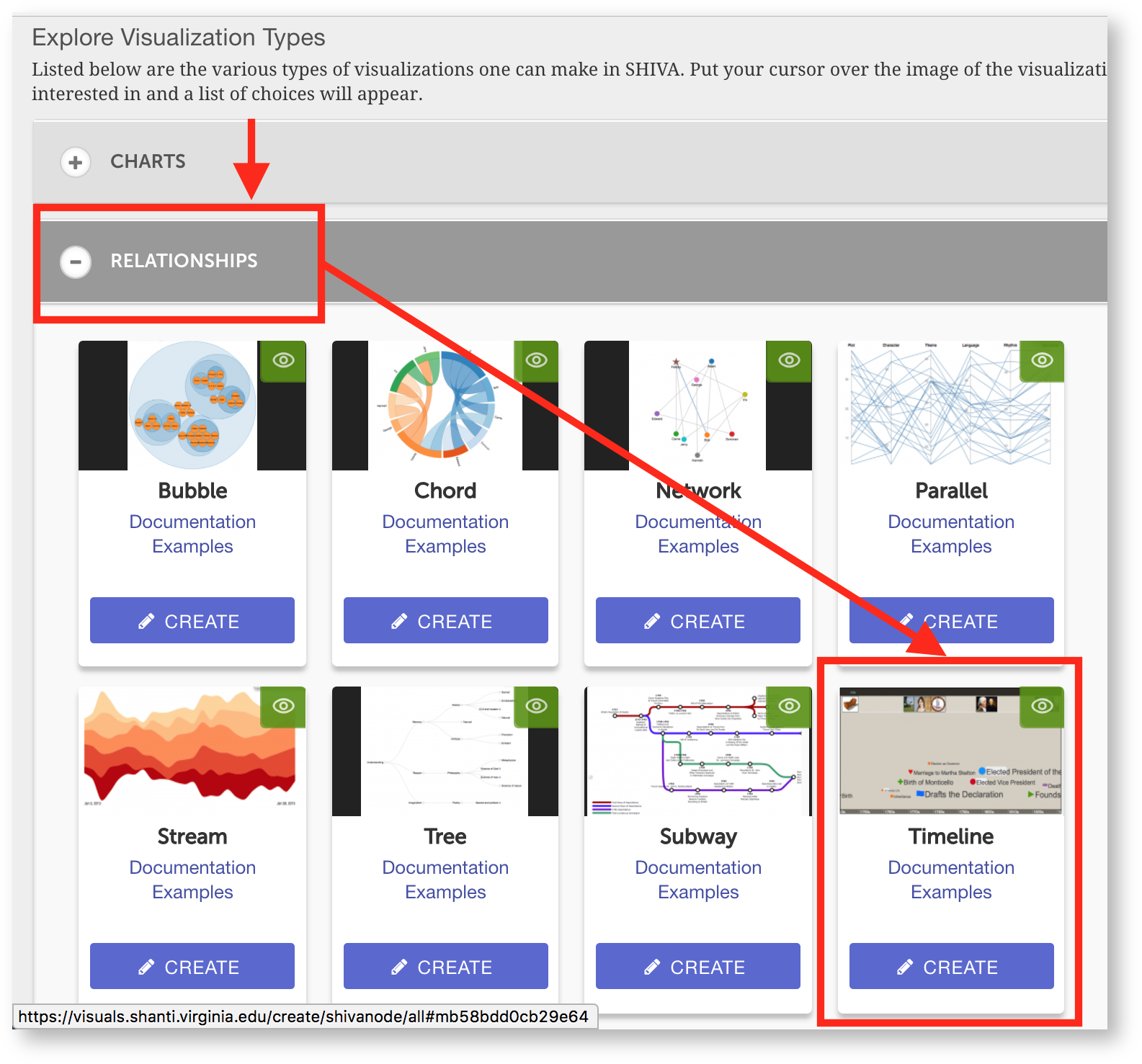
Choose Relationships, then Create under "." |
|
You'll see the visualization editor and a preview of your timeline. Now we need to add your spreadsheet to the editor.
Find the "Source of events" field and click on the triangle Google Drive icon next to it. |
|
You'll see a list of your Google Drive accounts. You may not have to do the last two steps: you might see your Google Drive files directly.
You'll see a Google Drive window in Visuals with a list of your files.
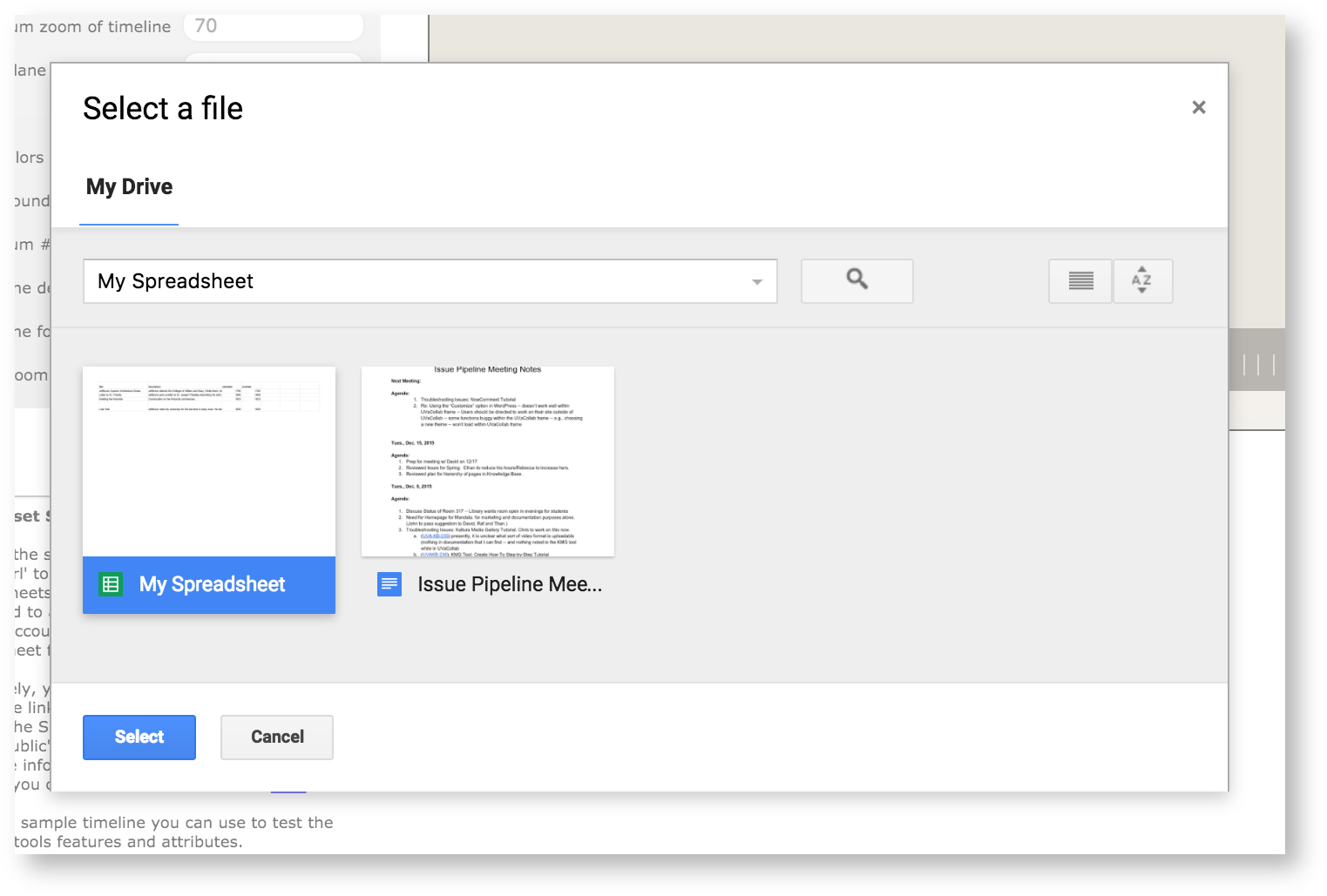
Select the spreadsheet you made in step 1. |
|
Since your students fill in the events, you won't see any information on the timeline. You might also notice that the range of times in the window doesn't suit your needs. You want the timeline to show all your student's events at first view.
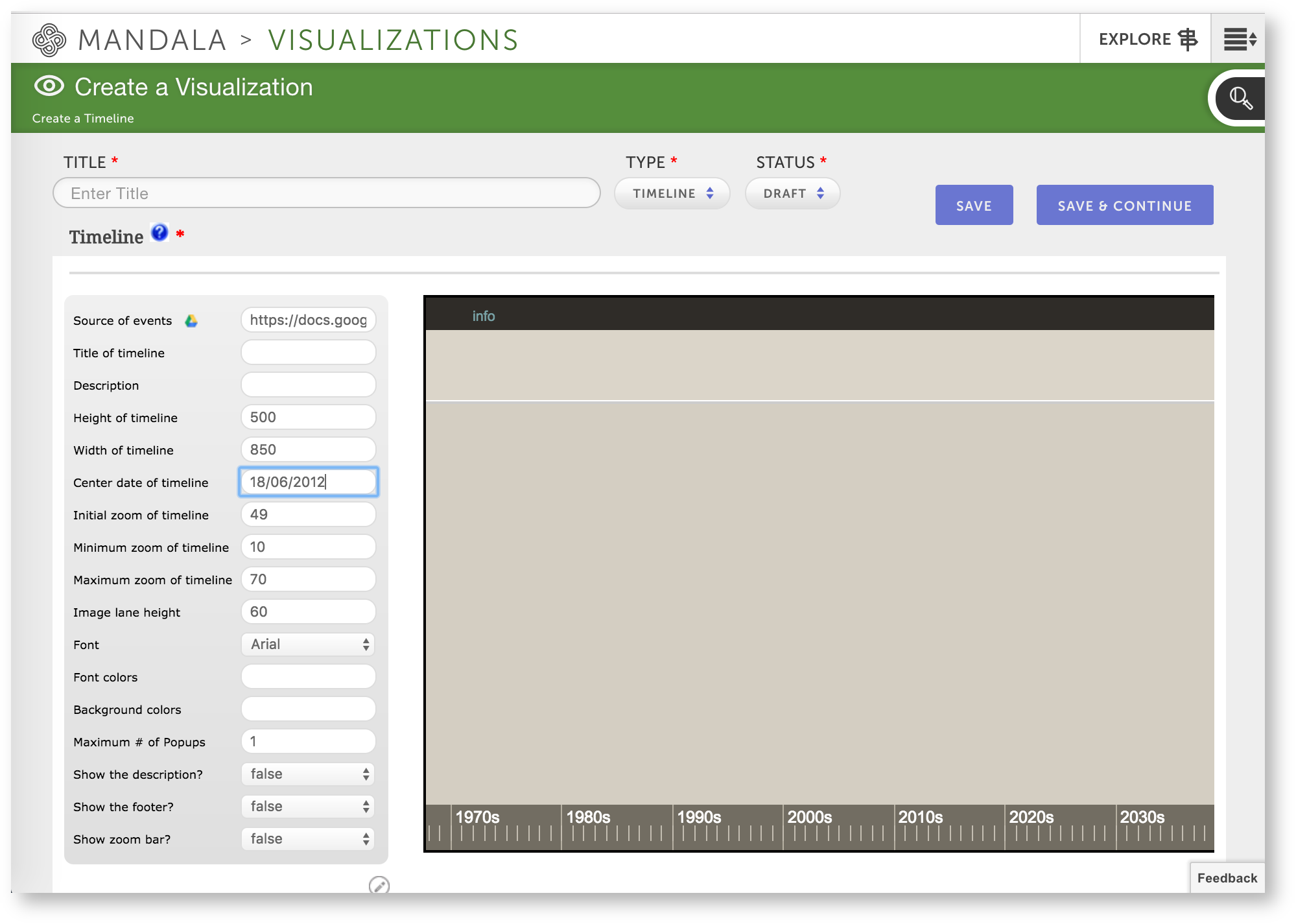
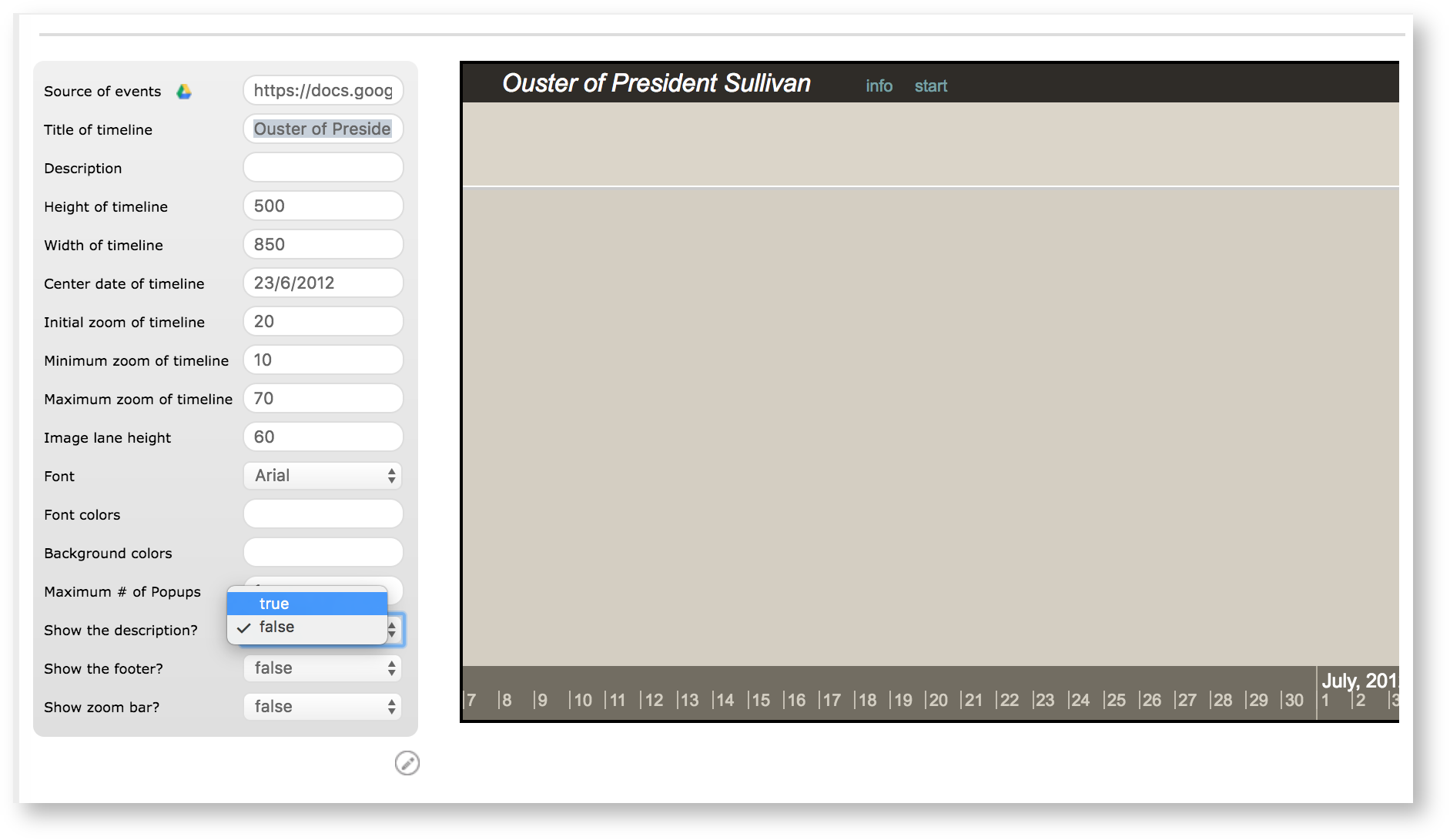
First, set "Center date of timeline." In our case, we checked UVA Magazine's timeline of the ouster and realized that events happened in a window between June 8, 2012 and June 29, 2012. Therefore, we centered the timeline on June 18, 2012. Since according to the visualization index you use a DD/MM/Year format for "Center date of timeline," we entered 18/06/2012. |
|
However, the scope of the timeline still isn't quite right. The ouster happened over the course of a month, but we are zoomed out to the level of years in the timeline.
We can adjust this scope using "Initial zoom of timeline." Since the value of this field is tricky to determine, we'll create two reference events for the "beginning" and "end" points of our timeline, then adjust the value of "Initial zoom."
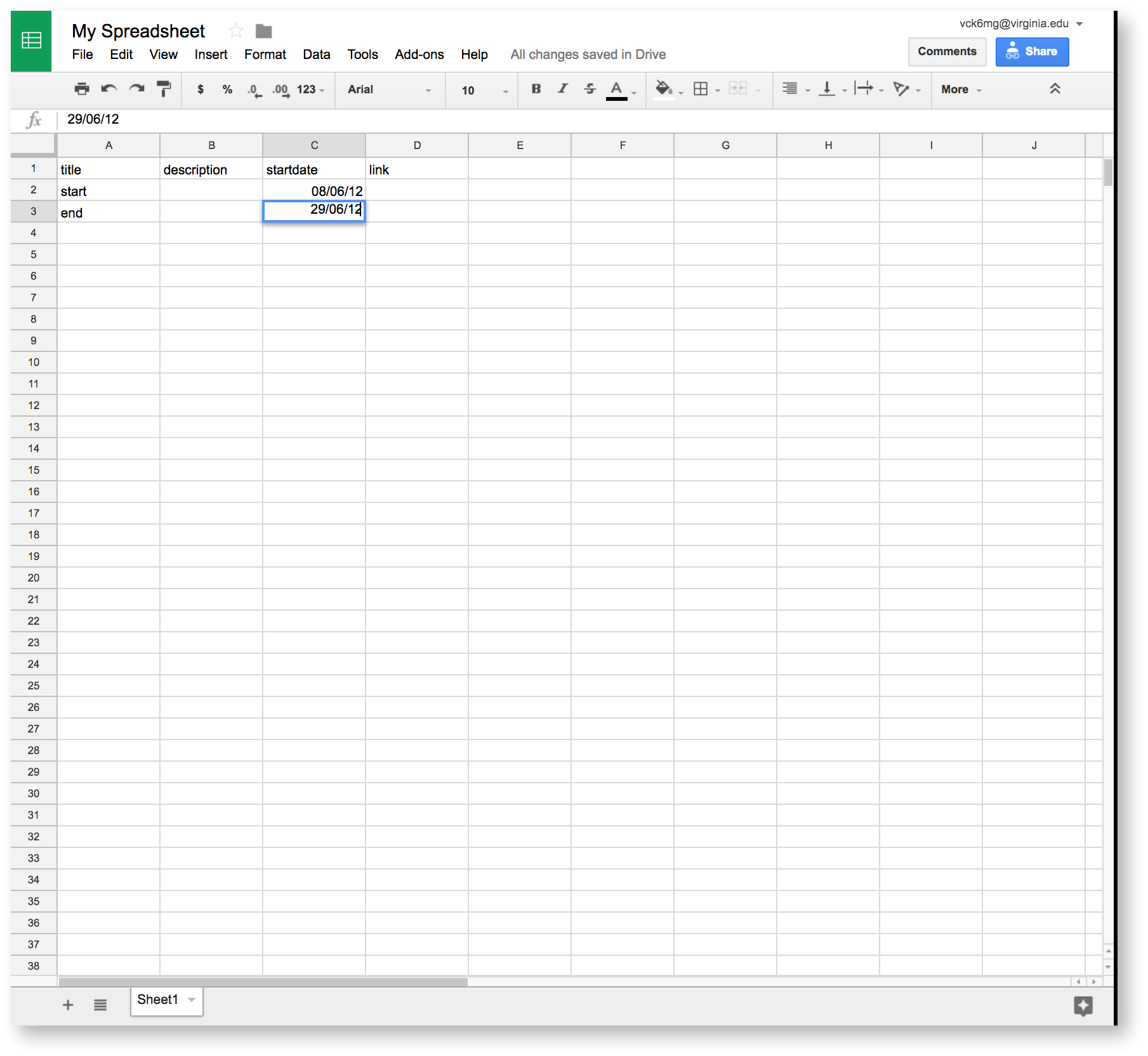
First, go back to the spreadsheet. We're going to create two events – one with a start date of June 8, 2012 and one with a start date of June 29, 2012. We'll call the first event "start" and the second event "end." Don't worry about names too much – these are temporary reference points, and we'll delete them at the end. Use the DD/MM/Year format for the dates. |
|
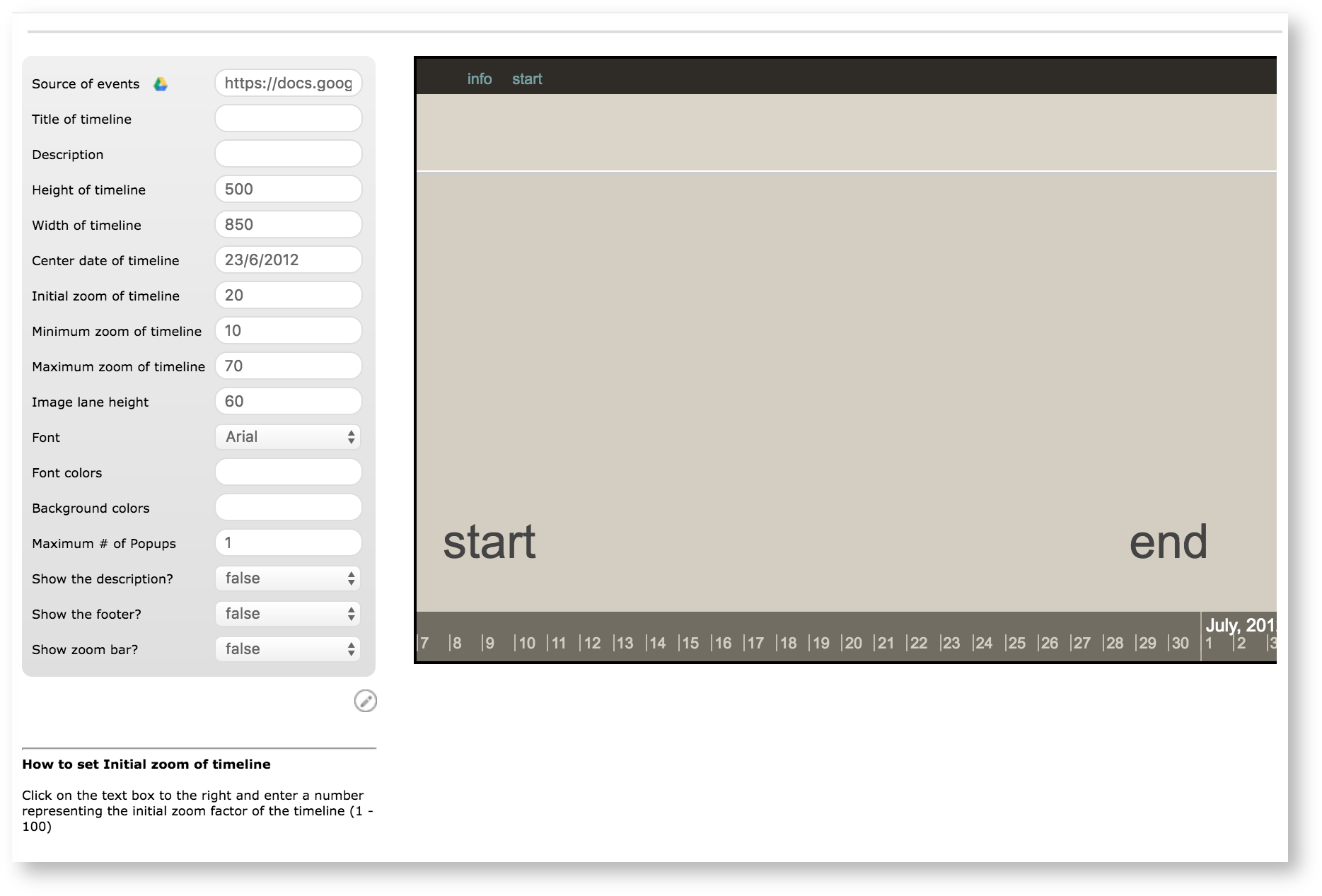
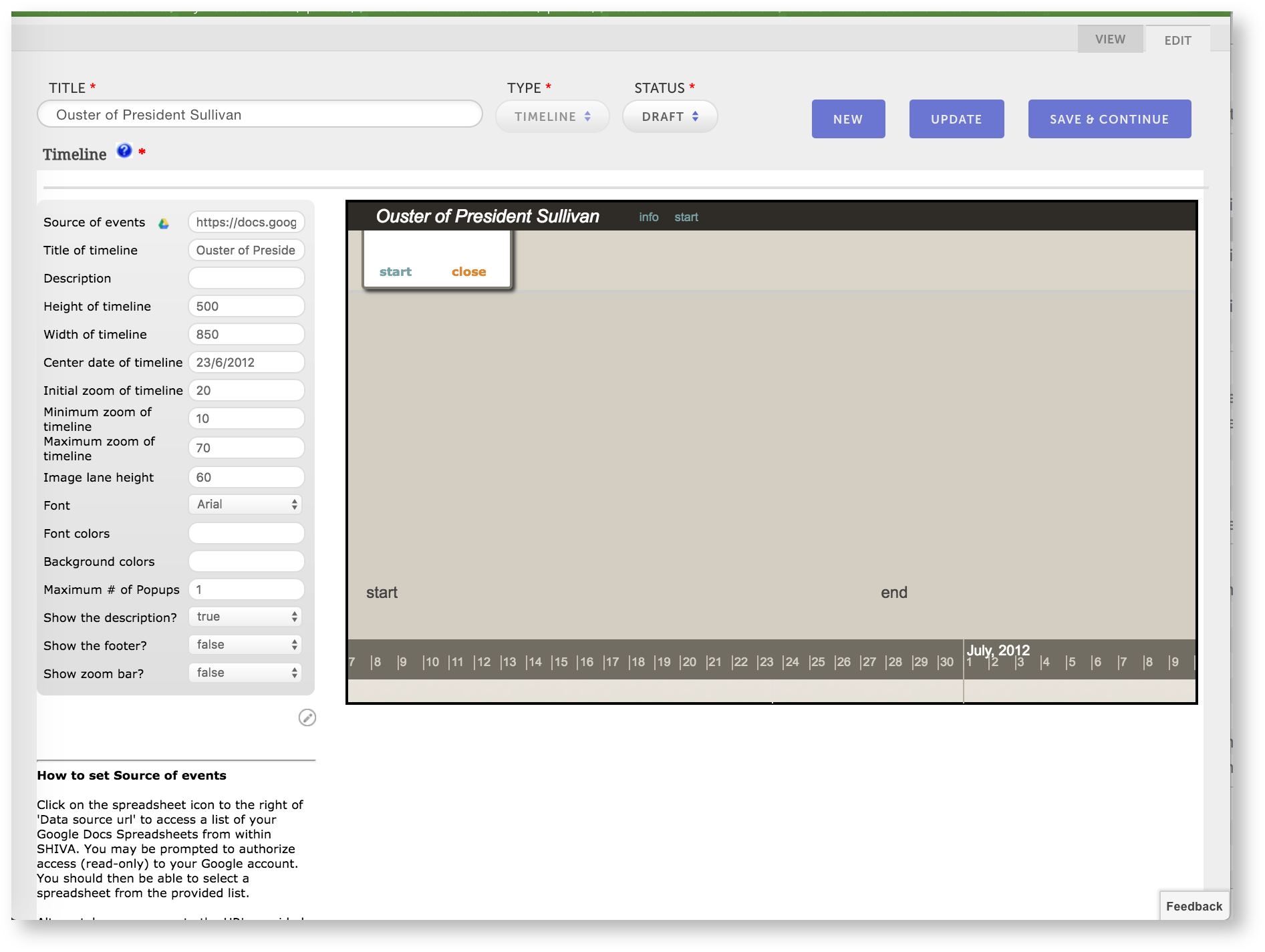
Now go back to the visualizations editor. Adjust the "Initial zoom of timeline" by small increments, increasing the value to zoom out, decreasing the value to zoom in, until you can see the "start" and "end" events at the opposite ends of the timeline.
Here are the values we ended up with. Notice we also had to adjust "Center date of timeline" by a few days. |
|
Notice the text "start" and "end" are a bit large. Remember, you're going to have to have students recording many events on this timeline. To set the size of the font, we're going to make a column called "importance."
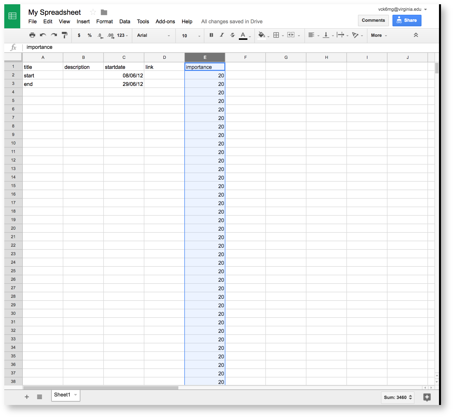
Enter "importance" in the first row of column E, then give all rows in the column a value of 20. |
|
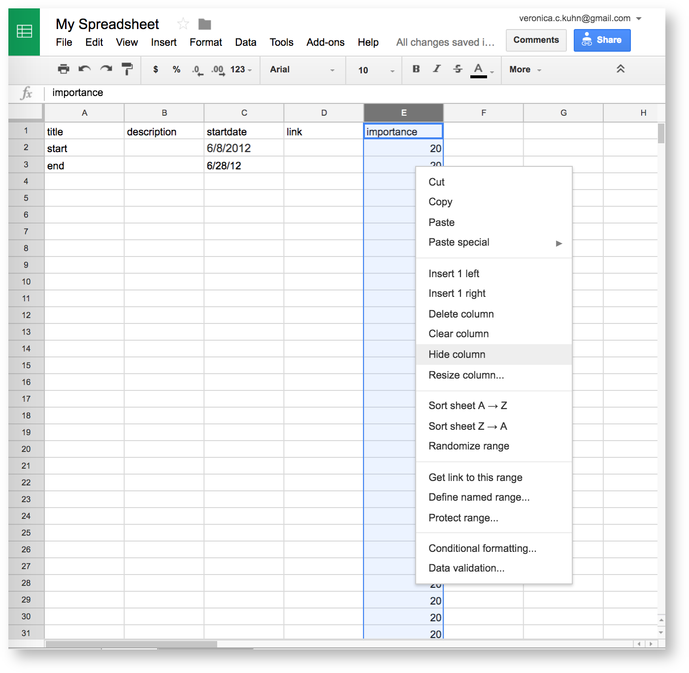
Now "hide" the column to prevent your students from worrying about this value. Visuals can still read data in hidden columns. To hide column E, select the entire column, then right click on it and choose Hide from the menu. |
|
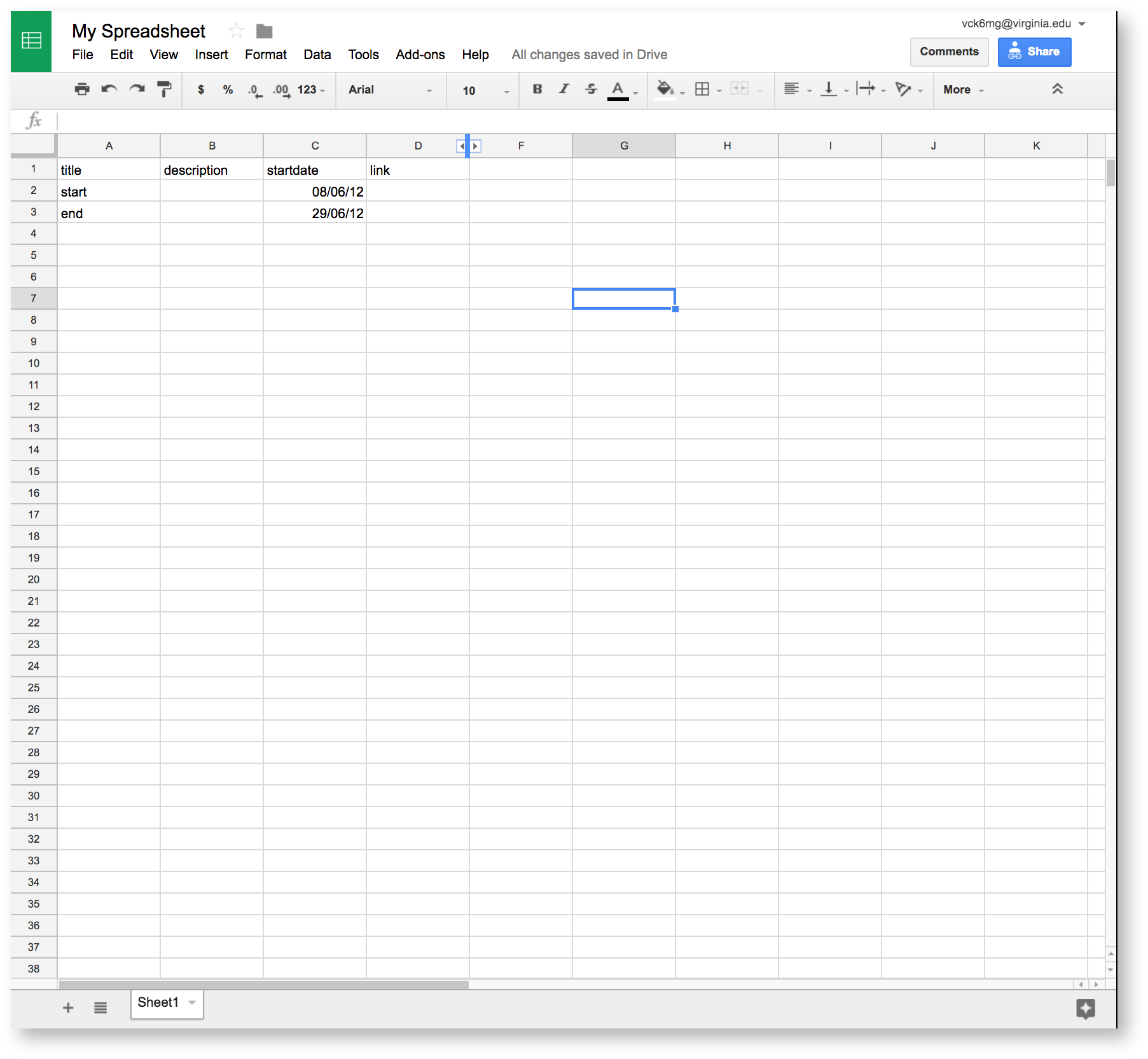
This is the hidden column. To unhide this data, click on the two arrows (< >) between columns D and F. |
|
When you go back to your visualization, you'll see "start" and "end" are now smaller. |
|
To finish, make sure that "Minimum zoom of timeline" and "Maximum zoom of timeline" are considerably smaller and larger, respectively, than the initial zoom value. This lets your students scroll in and out.
Now you can be sure all your student events will be visible in class. Remember, you can always zoom on the finished timeline. This method just helps you set the general scope.
The timeline still isn't very informative, however – how will viewers understand the significance of events? Let's make the visualization show a description of the event, which your students enter in column B of your spreadsheet.
To do this, change Show the description from false to true. Now when a viewer clicks on an event, a description will pop up. In the example, we've also entered the "Title of timeline." |
|
Now we're done with the main visualization.
Remember, you can find out more about the different options for your timeline with the Visualization Index.
To finish making your timeline, give the visualization record a title in the "Title" field at the top of the page, then choose Public under the "Visibility" options at the bottom of the page. Making the timeline public lets you add it to UVaCollab in step 8.
Switch the status of the timeline from Draft to Published at the top of the page. Then, Save your visualization. You're all ready for your class to create a collaborative timeline together.
 6. Invite student contributions in class
For the class, you should have a way to project your visualization. Once you've set up the projector, you can open your visualization by logging into Visuals, then:
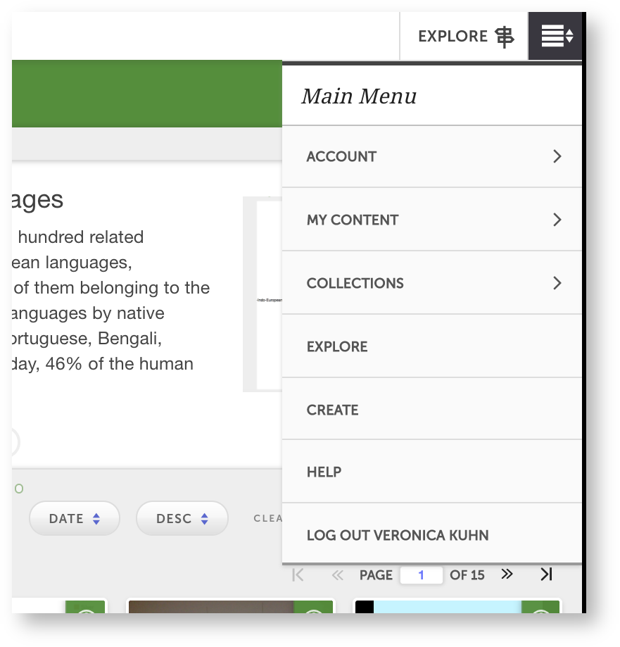
Click  > My Content > My Visualizations. You'll see a list of all your visualizations. Click on your timeline to open it. > My Content > My Visualizations. You'll see a list of all your visualizations. Click on your timeline to open it. |
|
Before the class, ask your students to bring:
- their laptops,
- a title for their event,
- a URL source for the event,
- a description of the event.
Share the timeline spreadsheet with your students. To do this, you should use the URL of the spreadsheet at Share > Copy Link in Google Sheets. If you've followed the spreadsheet setup process correctly, all your students need is the URL of the document to edit it.
In class, you can ask each of your students to add their event in a new row of the spreadsheet, like so. |
|
You can make this timeline available to your students after class in UVaCollab.
 7. Add the timeline to UVaCollab
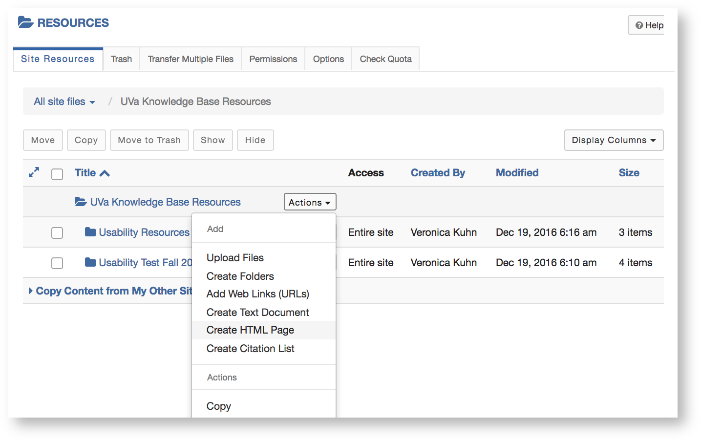
Go to Resources in the sidebar. |
|
Find the folder where you want to add the timeline. Next to the folder's name, click Actions, then Create HTML Page. An editing tool will open. |
|
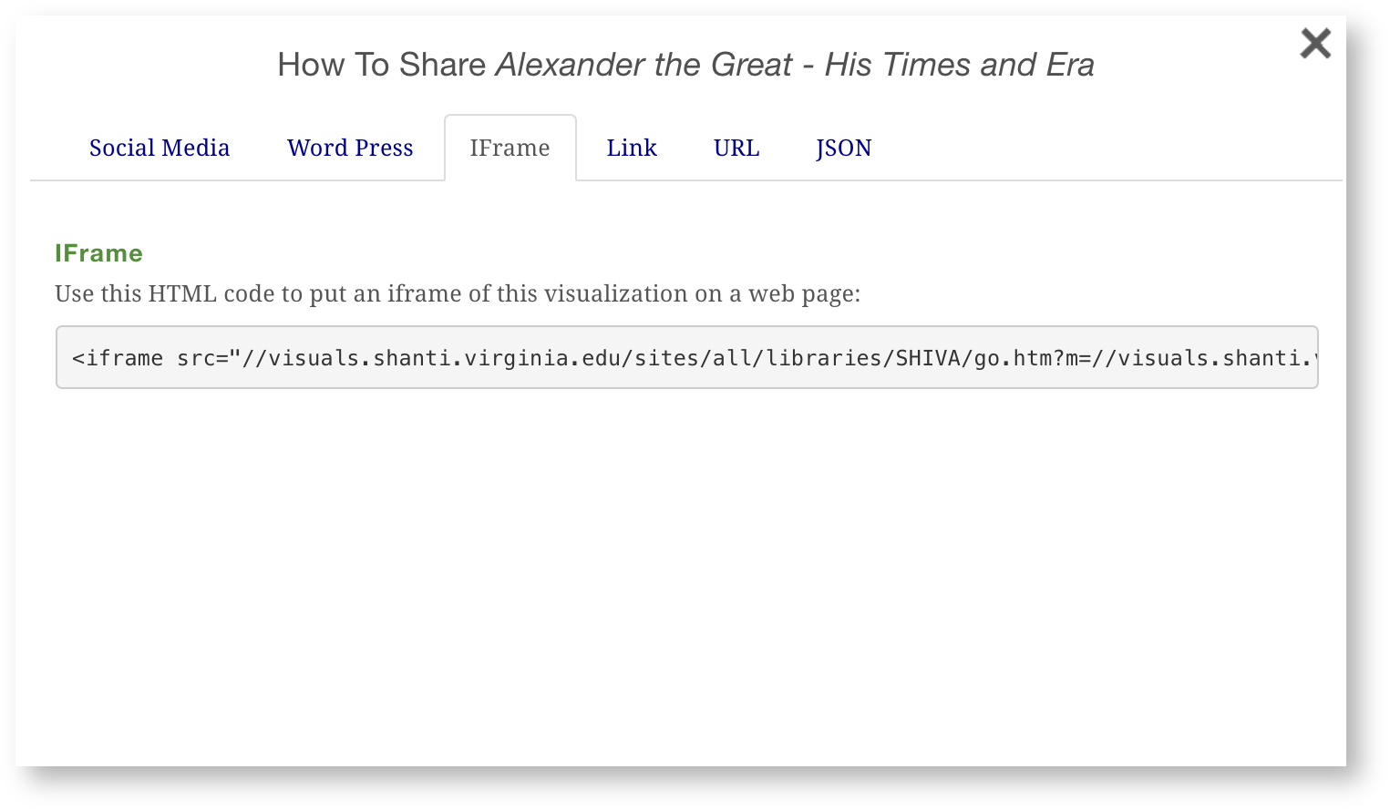
Now you need to fetch your timeline from Visuals. To do this, open the visualization, then click the Share icon ( ).
).
From the window that opens, click iFrame. This tab contains HTML code that will let you embed your timeline directly into the new UVaCollab HTML page. Copy the code and return to UVaCollab. |
|
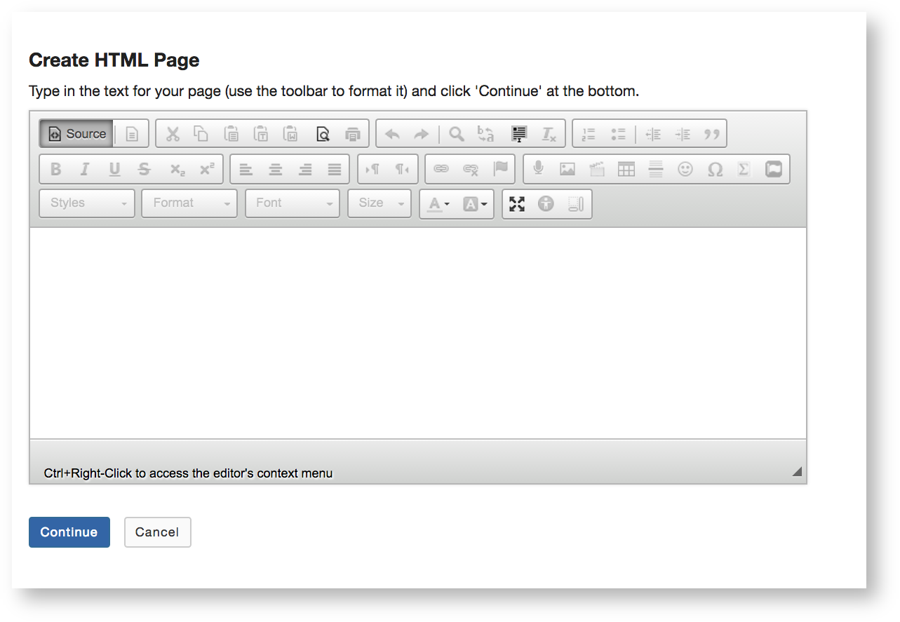
To insert the code into the page, you need to switch the UVaCollab editor mode to edit HTML.
To do so, click Sources in the editor toolbar. |
|
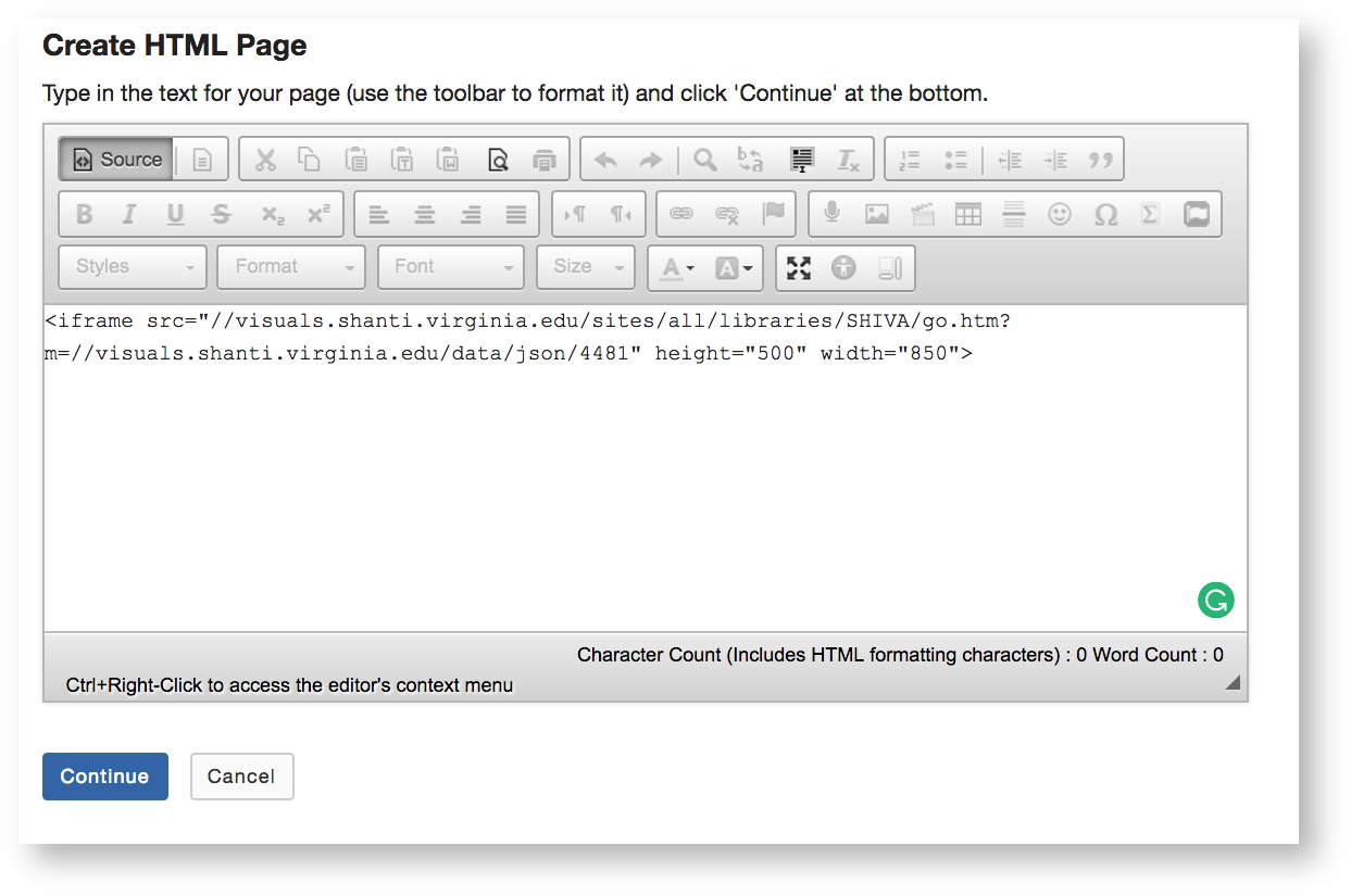
Paste the iFrame code into the editor, then Continue. |
|
You'll see a form with metadata fields, where you can add a title and restrict access to your HTML page. Fill out the fields as needed, then Finish. The new page will appear under the Resources. If you click on the site, you'll see the interactive timeline your students created collaboratively.
This code also lets you add the visualization to a WordPress course site. Follow the Add an iFrame guide for help.
Now you're finished with your project. To learn more about making visualizations, you can use this Visuals in Mandala guide.
