Example
Spreadsheet Format
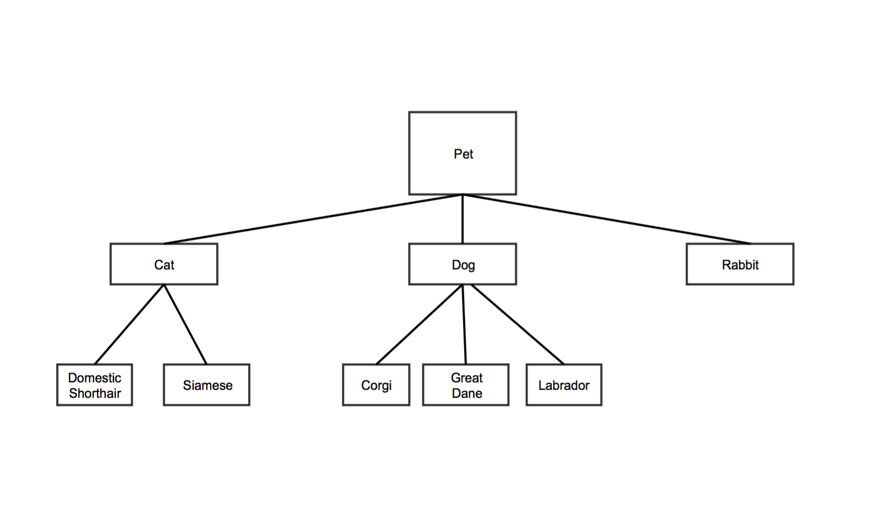
Tree data structures are hierarchical. Each node has a parent nodes. In the example below, "Pet" is the parent of "Cat," "Dog," and "Rabbit". "Cat" is the parent of "Domestic Shorthair" and "Siamese." "Pet" is also the root note, since it has no parent.

Each row in the Tree Map data spreadsheet represents a node on the tree.
| | Column 1 | Column 2 | Column 3 | Column 4 |
|---|
| Data Type | plain text | plain text | number | number |
|---|
| Contents | The name of the node. | The name of the node's parent. Note: - If this is the first node on the tree (called the root), leave this cell blank
- This name must match the entry in the first column of the row that defines the parent node
| A value for the node. Note: - This determines the size of the node relative to the other nodes.
| A second value for the node. Note: - This determines the color of the node relative to the other nodes.
|
|---|
| Optional | | | | x |
|---|
For the sample tree above, the first two columns might look like this:
| Node | Parent |
|---|
| Pet | |
| Cat | Pet |
| Dog | Pet |
| Rabbit | Pet |
| Domestic Shorthair | Cat |
| Siamese | Cat |
| Corgi | Dog |
| Great Dane | Dog |
| Labrador | Dog |
Customization Options
Go to Customize Your Chart for more options.
Font color: sets the font color for the text in your chart
- Click the colored square to choose a color for the text in the chart
- the ColorPicker tool will appear
- Choose a color by clicking it
The text will turn that color, as a preview
- Click Ok
Font family: sets the font style for the text in your chart
- Type a font style name into the textbox
- Note that it's best to use a standard font, such as Ariel or Times New Roman, to ensure that the font will appear the same way across different devices
Header color: sets the color of the header text for each node
- Click the colored square
the ColorPicker tool will appear
- Either: Choose a color by clicking it
- Or: Click No color
- the rectangle below the sliders will remain blank and your headers will be white
- Click Ok
The headers will appear in the color you chose
Header height: sets the height of the header section for each node
- Type a number into the textbox
- Note that this number can be zero
Header highlight color: sets the color a text header will be when a user hovers over it
- Click the colored square
- The ColorPicker tool will appear
- Either: click a color
- Or: Click No color
The rectangle below the sliders will remain white, and a header will not turn a different color when a user hovers over it
Maximum color: this is the color represented by the number in the fourth column of your spreadsheet. If you did not choose a value in this column of the spreadsheet, you can choose a color here to set the scale by the which the rest of the colors are generated.
- Click the colored square
The ColorPicker will appear
- Choose a color by clicking it
The section representing the highest value in the fourth column of your spreadsheet will turn that color
- Click Ok
Maximum color value: determines the value for the brightest color in your chart
- In your spreadsheet, rows with 4th column values greater than or equal to your maximum color will display the maximum color
- Enter a number in the textbox
Max levels: sets the number of node levels you want your chart to show at the same time
- Type a number into the text box
- For example, if you don't want to show any child nodes, type in 1, and if you want to show root nodes plus one child node, type in 2
- Note that if your tree has more levels than this number, the viewer will need to click the visible nodes to see additional levels
Max levels to hint at:
Maximum highlight color: sets the highlighting color of the largest node
- Click the colored sqaure
- the ColorPicker will appear
- Choose a color by clicking it
The color will appear in the rectangle below the sliders
- Click Ok
Middle color: sets the color for the node halfway between the largest and the smallest
- Click the colored square
- the ColorPicker tool will appear
- Choose a color by clicking it
The color will appear in the rectangles below the sliders
- Click Ok
Middle color value: determines the section of nodes that appear in the middle color
- Type a number into the textbox
- Note that nodes with values below that number will not appear in the middle color
Middle highlight color: sets the highlighting color for the node with a column 3 value that falls between the maximum color value and the minimum color value in your spreadsheet. The highlight will be a color between the maximum color value and the minimum color value
- Click the colored square
- the ColorPicker tool will appear
- Either: Choose a color by clicking it
- Or: Click No Color
- Click Ok
Minimum color: sets the color of the node(s) representing the smallest column 4 values
- Click the colored square
- The ColorPicker tool will appear
- Either: Choose a color by clicking it
- Or: Click No color
- Click Ok
Minimum color value: determines the least intense color that appears in your chart
- Enter a number in the textbox
- Note that rows in your spreadsheet with values less than or equal to the minimum color value will appear in minimum color on your chart
Minimum highlight color: sets the highlighting color for the node with a column 3 value that is nearest the minimum color value
- Click the colored square
- The ColorPicker tool will appear
- Either: Choose a color by clicking it
- Or: Click No color
- Click Ok

